|
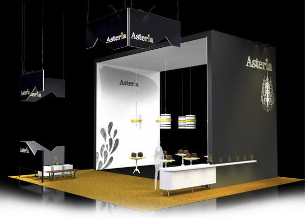
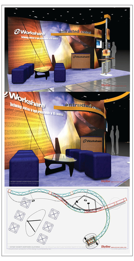
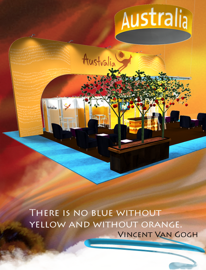
The common phrase, "united we stand, divided we fall" has long been used by nations and leaders to inspire people in presence of clear and imminent danger. However, when it comes to laying out the floor plan for your trade show booth design in a limited space (e.g 20' x 30' as shown above), distinctly dividing the floor space in to two unique areas, 'Love' and 'Work' might be a good idea to propel your brand into action. I was reading a great post the other day that spawned the idea for this article. The HBR blog post suggest that the age of snarkiness is behind us and now we are in the era of sweet love. The post successfully points out as to what is wrong with the Sonic commercial and dubs it as ineffective since it hinges on sarcasm not sweetness. Sweetness is back. Sweetness is big. Sweetness, against all odds, and quite against character, is having a celebrity moment. Brands gain huge currency when leading with sweetness. This trend in exhibiting sweet love is evident in the amount of space that are devoted to lounges and the so called hang out areas. Grant McCracken, writer and anthropologist, in his book Culturematic, talks about brand that makes headway are the brands that fosters co-creation. He says we want brands that are works in progress, engagements in and of the world. Brands need to be about becoming, not about being. The carefully designed hang out areas in your space can be a Culturematic cluster– a bundle of experiences, "investigating the world in a variety of ways, defined with enough intellectual generosity that several outcomes—some of them quite different–are possible". And if you are exhibiting at trade shows with horizontal target audience 'Cuturematic' might just be the way to go. After all, "culturematic is a little experiment that in a playful counter-intuitive way, broaches a kind of what if." It is a great way to keep the engagement going both at the show floor and after the show. If one half of your exhibit design is an ideal setting for Culturematic cluster devote the other half for customized demonstration. Demos at trade shows are essentially futile unless it is designed to solve specific problems that customers encounter. To help better cater to your clients and prospects, do your research and find out what are the attendees trying to accomplish by coming to a specific event. What are their pain points. Heck, send out tweets asking them about it. Find out what solutions are being adopted in other industries or other countries to solve similar problems. Armed with answers you then design few presentations that talks about solving targeted problems. Trade shows and are fertile grounds to ignite new brand culture. Wouldn't it be great if you knew the kind of content that is being shared by the attendees of these events. You can then gauge the commonly held beliefs and behaviors of your clients and prospects. Very soon you will find out if there is a contradiction of some sort. Once you detect it, your brand will gain transformational traction on a evolutionary scale. Of course, you will highlight the preference to build recognition. But what is really enticing is tapping into the collective anxiety and achieving a status that transcends functional benefit. One great example that comes to mind is Google. In the age of digital clutter, Google offers empowerment “to organize the world’s information and make it universally accessible and useful.” Question to ponder: How do I humanize my next trade show exhibit? Articles that you might like:
0 Comments
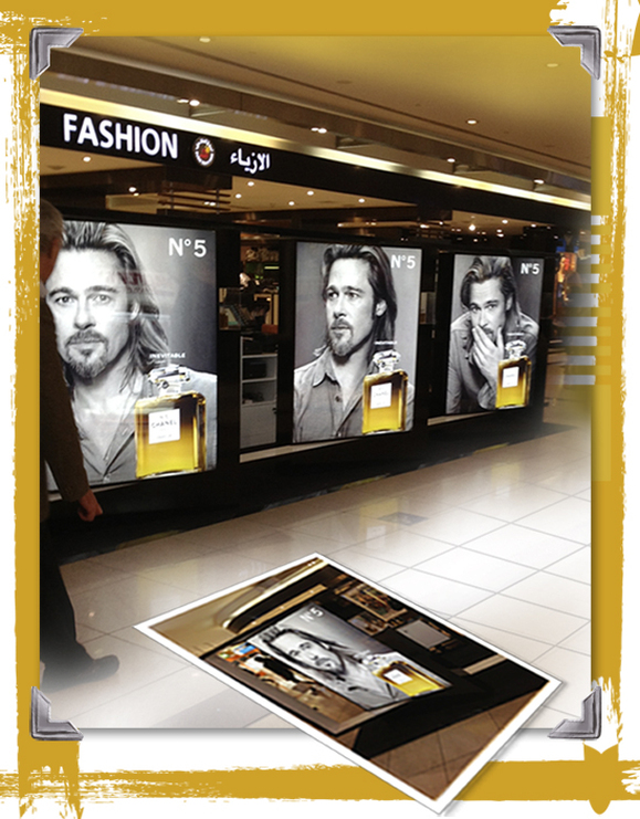
In my recent short visit to the desert kingdom of Dubai, I was amazed to find the Mega Star Brad Pitt in all his galore — popping out of the glitzy lobbies here and the fancy shopping malls over there. It seemed that the he was bigger than life, hotter than ever and very much at ease in the desert surroundings. In the midst of this fantastic Brad Pitt phenomena what caught my eye was this retail display that was so elegantly designed by Chanel. It is based on one primary principle; the principle of repetition. I was intrigued by the thought that living in a global society has no way diminished our strong connection to the ethnicity of this primal design principle that is so prevalent in the middle-eastern art. Islamic art and architecture is built on this cardinal principle of repetition. Islamic artists developed geometric forms with a knack for "repetition, symmetry and continuous generation of pattern." In this display, Brad is looking up at you with an aura of mystery, away from you and again at you. The right side of his profile is the repetition in form and the varied angles of his posture generates a continuous pattern in time and space. Indeed a very fluid presentation! The Principle of Repetition is a driving factor in designing trade show displays. Where contrast is all about showing differences, repetition brings a sense of unity, consistency, and cohesiveness. It helps to hold our attention in the maze of chaos and disarray. Our brains love it. Remember, the waking nights learning multiplication tables in your third grade? That is because our short-term memories can forget something (like a person's name) in less than a second. Repetition helps us to embed information in the longer-term memory. Designers use it with tact and skill. Marketers use it as a staple. At s sub-conscious level repetition is a key to persuasion. Repetition creates a pattern, which gradually grabs our attention and then creates the yearning for familiarity. Big brands are aware of it and hence the focus is always on building brand equity. Use repetition in your booth design and in the delivery of your marketing message You will have a phenomenal impact. Remember "Yes We Can"? "The more strikingly visual your presentation is, the more people will remember it. And more importantly, they will remember you." — Paul Arden Articles you might like
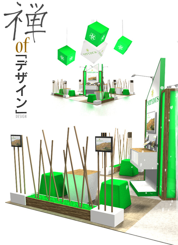
Simplicity is the shining armor of Zen.
Derived from the Sanskrit word Dhyana, Zen found its way to Japan via China in the form of motionless meditation. The word Zen paints a picture of peace, serenity, waterfall and rounded stones. It has become a part of our every day lexicon, yet we hardly practice what it exhorts. Be here and now. Turn off the filters. Dissolve all preconceptions. Perceive directly. "Dissolve into the eternal now, and realize that the Universe itself peers out through your eyes, hears through your ears, and breaths each breath." Experiencing each moment as it is. According to Chinese Ch’an and Zen, understanding comes only by ignoring the intellect and heeding the instincts, the intuition. True perception comes from vast emptiness. Whatever the philosophical construct of Zen may be, we all seem to have a visual concept of what Zen is. We talk about Zen like design, we muse on the elegance in the absence of abundance and of course the Zen Master of Subtraction: Steve Jobs is still very alive in our mass psyche. One of Jobs’ great strengths was knowing how to focus. “Deciding what not to do is as important as deciding what to do,” he said. “That’s true for companies, and it’s true for products.” In his book, The Laws of Subtraction (that will be available on October), Matthew May states 6 simple rules for winning in the age of excess, very much in keeping with the 5 principles of Zen Design Simplicity:
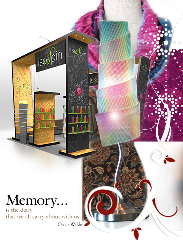
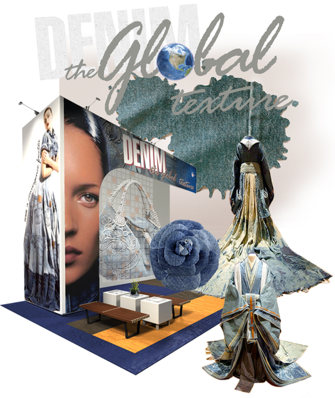
The relevance of this message in our busy business of trade show clutter is huge. Noteworthy, are the first 3 points. Usually, as trade show exhibitors we tend to blast away all the features that our products are capable of. But as Matthews puts it; What isn’t there can often trump what is. He cites the example of Scion. Designers essentially used this strategy in creating the fast-selling and highly profitable xB model, a small and boxy vehicle made intentionally spare by leaving out hundreds of standard features in order to appeal to the Gen Y buyers who wanted to make a personal statement by customizing their cars with trendy options. It wasn’t about the car. It was about what was left out of it. The discipline to discard that does not fit is the bedrock of Zen design. All aspects of your brand can only stand tall in an intelligently designed space that is anchored in elegant suggestive simplicity. It is the suggestive simplicity that engages human imagination, thus injecting it with the merit momentous memorability. Create a compelling environment. Unleash the memory capsule. Any designer who does not appreciate or know about good food is not a very good designer. The planning of a meal and it presentation - the texture, the color, the tastes, the hot and cold temperatures - are the same concerns that affect an environment. Robert Kime, Architectural Digest Pattern, texture, color, light are integral parts of design that aids to the memorability of a brand. Patterns come in various forms and colors. Thy may be abstract, anthemion, argyle or art deco, batik or basket-weave just to name a few. Patterns when combined with texture makes the architectural design rich and beautiful. The space either achieves harmony or excellence. Textures and or patterns are salient features that plays an important role in defining the rhythm of the exhibit design. Textures are recognized by touch and sight. As William Morris so elegantly puts it: "If there is a reason for keeping the wall very quiet, choose a pattern that works all over without pronounced lines...Put very succinctly, architectural effect depends upon a nice balance of horizontal, vertical and oblique. No rules can say how much of each; so nothing can really take the place of feeling and good judgement." “Light is the magical ingredient that makes or breaks a space." Add lighting to the mix and you construct the element of feeling. The space starts to communicate to you at a cellular level. Light when diffused off textured surfaces form interesting patterns. Directional lighting amplifies a texture, producing variations in shadows; soft, diffused lighting, on the contrary, minimize contrast and shadows, making textures difficult to read. A perfect example of the play of light, texture and color comes from Evonik Industries. PLEXIGLAS® Textured Sheet RADIANT creates colors that change according to the viewing angle, which is known as the Radiant effect. There is a colorful play of hues that is set off to particular advantage by the surface textures. Patterns and textures have been part of our life since the per-historic era. Evident everywhere from cave paintings to skin art they play an important role in everyday life and have cultural, religious, and philosophical significance. Our ancestors derived their inspiration from the organic world and everyday objects. Their art has not been forgotten. It dwells deep in our psyche."Old patterns seem excitingly fresh when rejuvenated by a contemporary palette." One perennial design feature always to remember: Contrast is the magic key. The light and the dark "the old and the new, the rough and the soft. The clash of it all is very sexy." Articles you might like
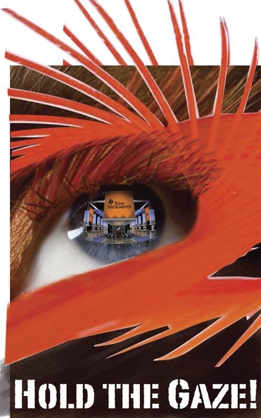
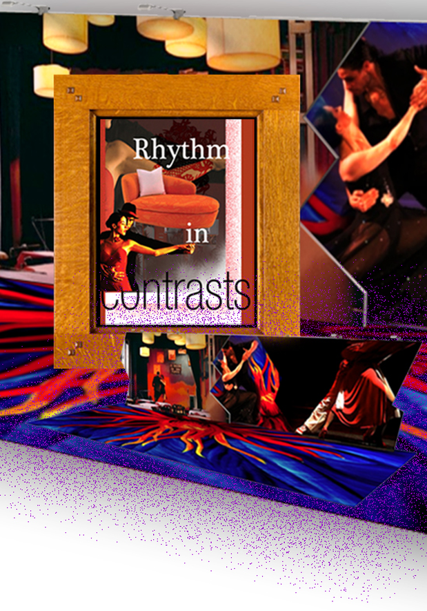
Leatrice Eiseman, Executive Director of the Pantone Color Institute, explains, “…Tangerine Tango is an orange with a lot of depth to it…sophisticated but at the same time dramatic and seductive…” She goes on to say, “Tangerine Tango marries the vivaciousness and adrenaline rush of red with the friendliness and warmth of yellow, to form a high-visibility, magnetic hue that emanates heat and energy.” A perfect choice of color, to contrast the year of the Black Dragon. 2012 happens to be the domain of the Water Dragon and according to the Chinese Five Element Astrology, black is relates to water. Thus, it is safe to infer that the overarching message for this year is the dance of fire and water: a rhythm in contrasts. As designers, we often play with the principles of rhythm and contrasts. Rhythm is the movement of our gaze to scan the message for understanding or gain information. Rhythm is usually achieved through repetition of objects, colors, and placement in the composition of design. A serpentine is a perfect example of rhythm in motion in a 3D design architecture. Contrast on the other hand stresses the visual differences in size, shape, angle and color between the elements to elevate the awareness of an intended message. It is the quickest way to shower visual treat and to draw attention to your exhibit design. It leaves a hypnotic trail in the minds of the trade show attendees. However, the principle of rhythm in contrast is much like a dance of tango. "Movements are sometimes slow and slithery, and other times sharp and stacatto, such as a quick foot flick or a sharp head snap to promenade position" Yet there is an intoxicating rhythm to it. "Warning: tango contains highly addictive ingredients, such as pain, pleasure, passion, excitement, connection, freedom, torment, and bliss. In seven out of ten cases it takes over a person's life." In the world of exhibit design, the rhythm in contrast plays a dominant role in the integration of the vivacious curves of lounge furniture with the angular purity of the display architecture. Two opposites coming together to create the "fantasy of a harmonious whole." Articles you might like
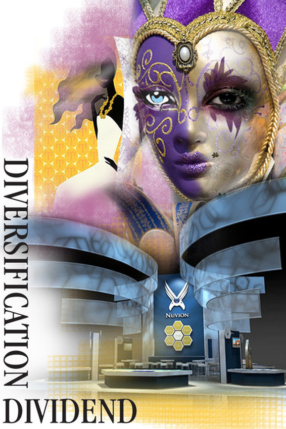
In the summer of 2007, the US stock market plummeted by 5%. In the same week FTSE lost about 5.6%, Israeli TA 25 Index dripped 7% and Australia exchange shed 3%. This was mirrored across the global stock markets. Singapore, Hong Kong, South Korea, India and China all followed suit. As the financial instruments of the developing and the developed countries have started to look alike "we have voluntarily narrowed our options to the point of jeopardizing our ability to survive." Nature, does not condone singularity. It leads to extinction. Rebecca Costa in her book, The Watchman's Rattle: Thinking Our Way Out of Extinction, says, in evolutionary terms, diversity acts like a genetic insurance policy—to guard against the complete eradication of species. This is reason why there are 17,500 species of butterflies in the world, and around 750 species in the United States (Encyclopedia Smithsonian). A species that develops a broad range of characteristics and behaviors—wide diversity—increases its odds of surviving a broad range of environmental challenges. In December 2004, when the great Tsunami claimed more than 150,000 lives, the stone age tribes of the Andaman and Nicobar islands escaped unscathed because they took to the forests and higher ground well in time. Dr. Yaneer Bar-Yam of Harvard University exposes the critical role diversity plays as complexity in business grows: "A system performs well in facing complex challenges when it has high variety. We can understand this in the case of the modern economy and technological and corporate innovation." The greater the diversity of ideas, products and services, the more effectively businesses can respond to dramatic shifts and changes. For that reason, Apple has products that ranges from defining nano life style to the dream machines of the 3D designers and artists. For that very same reason, the latitude of Skyline products range from extreme portability to custom modularity and not to mention more than 30 elastic product lines in-between. For that very same reason, exhibit designers of our times should incorporate the essence of the brand in the visuals, architecture and of course, need-less to say in the interactivity that is the hallmark of face-face-marketing. Socio-biologists confirm that some 5 million years ago, with the development of two-legged locomotion, our brains experienced intricate adaptation to an "avalanche of new sensory complexity". If that is true, we are yet again undergoing paramount changes in the frontal cortex, the area that processes complexity. We are on for an interesting ride! Articles you might like
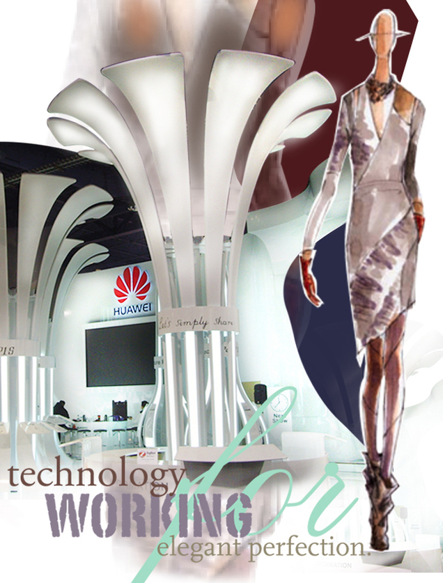
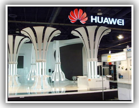
Perception Matters! In a visual marketing bazaar such as trade fairs and conventions, every visit to your booth space leads to a build up of pre-conceived notion that is carried on every subsequent encounter that your clients might have with your products and or your services. Be very purposeful as to how you want your brand to be perceived. You walk into a space of clutter, confusion and mundane the products and services will be perceived as such. On the other hand you walk into a space of elegance, simplicity and controlled light; you are in a perceptual space of high technology and smart efficiency. You see, simplicity and complexity are mutually dependent. Because, technology only continues to grow more complex; there is a massive economic and emotional advantage to present it in a simple and humanized space. Be Aware! Your brand elements like logos, tag lines, trademarks, packaging and your display might be yours; but the reality is, it is owned by your customers and your prospects; it is their perception of your company that impacts your bottom line and ultimately your survival. We live in a 24 hour connected world. Be aware of the savvy planetary word-of-mouth. Be aware, even before you get to pitch about your brand uniqueness, you might be encountering prospects that have formed perceptions about your brand. If it is positive, your brand achieves victory, if it is negative, you shift in the mind-set of damage control. Triumphant lesson from Avis: When Avis (the # 2 car rental behind Hertz) anchored in "We try harder", all of a sudden the brand gained momentum to aspire for something bigger: the perception that played out was being #2 is positive and goal oriented. Propagating the Positive Perception. Start with how you want your customers and prospects to think, feel, remember, and experience your exhibiting space. The over arching goal should be Positive Memory Retention. Be courageous to be different and make memorable limbic connections with your visitors. Focus on white space. It is your strategic weapon. Let it be. — Do no cover every surface with your story. Remember, we live in an overwhelming information grinding digital age. Your exhibiting environment should be all about subtracting the obvious and adding the meaningful. Architectural elements and textures should work towards empowering your brand style and image. Do not use elements to define your style. Your brand becomes commoditized. Great example is bamboo being synonymous with Green. If you want to convey Green ideals, it is a good idea to stay away from the invasive bamboo and perhaps try the controversial hemp. It is guaranteed to trigger the memorability factor amongst your audience. Hundreds of images came across my desk from CES 2012. However, the synaptic nerves made new connections when Huawei appeared. It happened to be the memorable trigger factor for this article. Thank you Huawei. You look magnificent! Articles you might like
Resting in magnificence, between passionate red and optimistic yellow, is the fun flamboyant orange. It evokes a contradiction in dualism. It is a "love me' or a "hate me" color. Orange is that color that has manifested in our reality as an envoy of safety as well as an agent of death. It is the requirement of OSHA that certain construction equipment and accessories be painted safety orange. Dioxin in Agent Orange is known to cause cancer, birth defects and dysfunction. The psychological effect of orange is instantaneous. It screams attention and haste. It gives strength and energy to your visuals, delivering an instant impression that is most often universally understood. Orange work wonders in chaotic market places like trade shows. It exudes energy and confidence and stimulates activity. It is often called the "silent salesperson" for it encourages people to gather and socialize. It also inspires physical confidence and individualistic independence. Orange is a high-arousal color. It relates to the primal gut instincts. It is the color of the Sacral Chakra. It is the seat of our inherent creativity. The energy associated with orange brings about increased feeling of motivation, well-being, positive thinking and inner joy. Perhaps, that is the reason the color choice is saffron for the sages and seers, since the beginning of time. Use orange to stimulate your appetite and your performance. Orange is always on the move. Orange brings out the extrovert in you and releases you of your inhibitions, often encouraging you to express your inner calling. It is the color of adventure. Use it as your guide. It will not fail you. Find yourself. Be the blazing trendsetter that you are! Articles you might like
The goddeses of the spirit who inspire the creation of the arts, the sciences and the very intelligence of creation itself is what we call muse. It is the underlying force that compels us to be greater than who we think we are. It is the source of our inspiration.
In Greek mythology, muse has been attributed to the characteristics of the 9 daughters of Zeus and Mnemosyne; keeper of the arts and the sciences. One of the daughters, Calliope, is best known as Homer's muse, the inspiration for Odyssey and Illiad. Likewise, Urania is the “heavenly muse” invoked in John Milton's epic poem Paradise Lost. Through out the ages, mankind has always saluted this inner knowledge as the driving force for all their creative pursuits. As we are closing in on one year and embarking on another, I dared to embark on this journey, to find out if there is a methodology to musing. It would be foolish of me to think that I can wrap it up in a neat little package, when so much has been researched about it. Yet, I believe, if we start with a very simple belief system, we are well on our way to be the creators monolithic greatness.
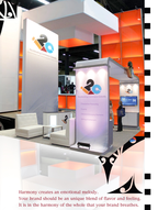
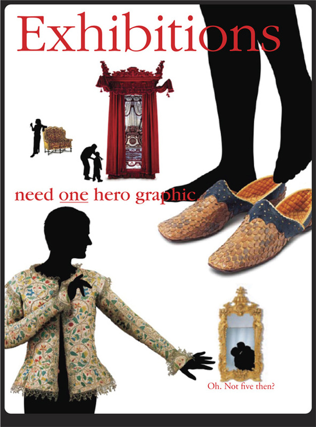
Our belief system dictates us in setting our aims and achieving our goals. Michelangelo reminds us: “The greater danger for most of us lies not in setting our aim too high and falling short; but in setting our aim too low, and achieving our mark.” If we could see the miracle of a single flower clearly, our whole life would change. ~ Gautama Buddha, circa 563 B.C.E No one understands this miracle in one, more so than trade show designers and exhibit visual designers. The perennial philosolphy "Pick the best and use it everywhere" is usually the foolproof rule of exhibition and gallery graphics. However, it would be impossible for an institution with rich heritage and artifacts ranging from hundreds of years to focus on ONE. For exmple, British Galleries at the V&A contained 400 years of the finest British furniture, art, and interior design ever collected. Picking one was going to be tough. So Michael Johnson picked few instead and let the visitor imagine what wearing, leaning on, or snogging in front of all these treasures might feel like. Every artist have slightly different list of principles. Usually, the four below works for me. Emphasis - "Center of Interest." It is about dominance and influence. Most artists put it a bit off center and balance it with some minor themes to maintain our interest. Some artists avoid emphasis on purpose. They want all parts of the work to be equally interesting. Harmony - As in music, complementary layers and/or effects can be merged to produce a more attractive whole. The composition is complex, but everything appears to fit with everything else. The whole is better than the sum of its parts. Unity - "When nothing distracts from the whole, you have unity." Unity without variation can be monotonous. Unity with diversity generally has more to offer in both art and in life. Of course, some very minimal art can be very calming and at times even very evocative. A simple landscape can have a powerful effect. Opposition - This is my favourite. Usage of contrasting visual concepts. That plains of Dakota with "big sky" landscape becomes very dramatic and expressive when a storm builds in the southwest. Articles you might like
|
Archives
September 2020
Categories
All
Don’t bend; don’t water it down; don’t try to make it logical; don’t edit your own soul according to the fashion. Rather, follow your most intense obsessions mercilessly. Franz Kafka |













 RSS Feed