|
It is a striking irony that in a bio-diverse planet such as ours we thrive on the competitive herd mentality of trying "to fit in". We like to play it safe. We like to trod the path that have been traveled ten thousand times. We have forsaken the imaginative spirit of David Livingstone to be "the creatures of the commonplace, the slaves of the ordinary". The best we can do is "new and improved" of the same old stuff. For example, the daily staple jeans: we have a choice of high rise, low rise, classic rise, boot cut, straight cut, wide leg, skinny flair and more of the same. In vain, we do not think about fabricating jeans that will interact with the atmospheric conditions to provide optimum wearing experience. The technology is there yet the imagination and the capital to take it to this level is sure lacking! 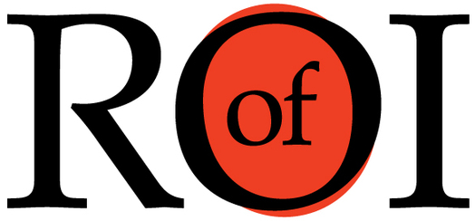  In this terrain of sameness, Harvard Business School professor Youngme Moon strikes out as an evangelist of "Difference". Her message is elementary. Yet it is the key to survival in the post-modern era of Globalization 4.0. "In category after category," she writes, "companies have gotten so locked into a particular cadence of competition that they appear to have lost sight of their mandate–which is to create meaningful grooves of separation from one another. Consequently, the harder they compete, the less differentiated they become ...Products are no longer competing against each other; they are collapsing into each other in the minds of anyone who consumes them." In her new book "Different" she talks about successful companies and leaders don't just try to out compete their rivals at the margin. Instead, they aspire to redefine the terms of competition by embracing one-of-a-kind ideas in a world filled with me-too thinking. Companies should be in the business of what Professor Moon calls "idea brands," products and services that challenges the very concept to its' core. Cirque du Soleil is an idea brand, a circus that re-engineered the concept of mechanical, acrobatic performance into orchestrated rhythm of art and story telling. So is Harley-Davidson, which invented the idea of high-nosed, mid-aged, white-collar, weekend "biker outlaw." So is Skyine's Arrive. It re-defines the idea of trade show portability by packing a whole 10'x10' display unit into one carrying case. And so is Dove soap, whose Campaign for Real Beauty challenged the preconceived notion of fashion and style. If you want to be the idea behind the "idea brands" ask yourself: If your company went out of business tomorrow, would anybody really miss it? –as the advertising legend Roy Spence would say. Or one might say, are your bags of goods and services so distinctive that it has become seamless to the consumer experience. Very few companies can vouch for it. This is why so many companies feel like they're on the verge of going out of business. Here is the key question to ask: If you are doing things the same old way, selling same old stuff, what would prompt you to do any different? The cardinal point to remember: Being different is the ROI of memorability. Articles you might like
0 Comments
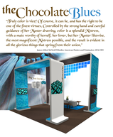
 I believe, Goethe was the first man to challenge Newton's theory of light and color based exclusively on physical phenomenon. He was the first one to point out that color sensations interacting with our brain cells are based not on the principle of optics but more so on our perceptions of our primal emotions. In his color teachings, Goethe called the color blue a “delightful nothing”. Blue is pleasant, because “it doesn’t press us, but only lingers”; it gives a feeling of boundlessness and space. The ancient Greeks acknowledged blue to be nothing of material origin; "a color of perspectives, ethereal as the color of the sky, the ocean, the shadow of the moon, the unreal." Hence, it is no surprise that blue is the overwhelming favorite brand color. It conveys dependability and consistency in a business world that is anything but consistent. When brands are expressed in the experiential visual market place like trade shows; it is also no surprise that blue is the safest color of choice. Safe but not sure. A close relative of blue is turquoise. It renders the peace, calm and stability of blue; balance and growth of green and the stimulation of yellow. Turquoise recharges our spirits and grounds us during times of high sensory overload. It assists in the development of organizational and management skills. It is a silent influencer rather than a demanding look at me. Hint: Pepper your communication areas with this color. Balanced between the extremes of red and violet, turquoise is the color of equilibrium between our emotions, thoughts and speech. Turquoise is a friend of public speakers as it calms the nervous system, gives control over speech and expression, and builds confidence. Hint: Design your stage area with turquoise overlays. The very least: print your speech notes on turquoise. You will feel the stabilizing effects of this color every time you glance at it. Turquoise hoists the levels of creativity and sensitivity. With confidence it forges ahead; balancing the pros and cons, the right and wrong, of any situation. Hint: Use it in showcasing your existing products or to highlight a new product. Play with the variations of turquoise to exhibit an environment of strength, triumph and poise. Use aqua for re-freshing strength, aquamarine for dynamic exhilaration and sophisticated teal for age old commitment. Turquoise is ideal for both the male and female audience of all ages. Combine with red, orange or yellow for targeting the active, male principle. Flavor it with soft pink, lavender or pale lemon for the female form ideal for the fashion industry. Coming from a culture of brilliant technicolors, I am eternally fascinated by its diverse dimensions. I share with you as I learn more and more of it. However, the inspiration for this write up comes from White Oleander. “She would be half a planet away, floating in a turquoise sea, dancing by moonlight to flamenco guitar.” Emotions so richly experienced by weaving nouns and verbs.....The clutch of colors in our collective psyche! Articles you might like
 The fact that Pinterest in now the third most popular social media site, beating Linkedin and Tumblr tells us something about the contemporary mass psychological movement. We are in the Age of Visual Content Revolution. Visuals have become the greatest crutch in the continuity of story telling. Ford, IBM, GE just to name a few have made the transition from stogy boardrooms to being active participants in this mass upheaval of ideas and culture. For artists designers and the creative folks, story boards and visuals were always part of the DNA. Now, visuals are grasping hold of marketers from different industries and they are realizing the forcefulness of visual marketing. Visuals make your Brand Fluid! Visual content draws upon your brand heritage and legacy. It helps in the story telling of your brand. For example, the new Facebook timeline is set up for companies to have opportunity to share their history visually, like Coca-Cola has done below. 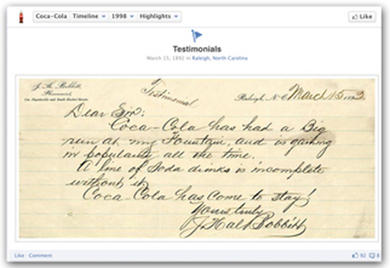 Brands like Starbucks, harnesses the power of social media to demonstrate what is going on behind the scenes between employees and customers. This humanizes the brand and promotes brand loyalty and awareness between companies and consumers. They have used visuals to make a powerful statement about their brand's stance on important issues that they believe in. Visuals make your Brand Captivating! Visuals capture more than just attention – they capture your heart and drives engagement. In fact, just one month after Facebook introduced timeline for brands, Simply Measured reports that engagement is up 46% percent per post, and visual content (photos and videos) have seen a 65% increase in engagement. Kudos to GE. They have proactively asked for fans to engage with the photos of their products, and the results are phenomenal! Now you know why status updates is loosing the battle to visual updates. Visuals make your Brand User-Worthy! If your customers are on at least a couple of the visually-friendly social networks like Facebook, Pinterest, YouTube, or Instagram, get them involved in helping shape the story of your brand in a more visual way. Keep in mind that there are multiple industries in which prospects won't make a purchase without first consulting user-generated content. That is the reason perhaps why Dunkin Donuts is encouraging fans to create visual content that gets them excited about their product. Referral traffic from social media sites to brand websites is on the rise. Shareaholic study revealed Pinterest generates more referral traffic than Google+, YouTube and LinkedIn combined; only Facebook and StumbleUpon generate more. Bottom Line: Social networks are a direct link to how customers get to your actual website. When brands are communicated through visual mediums, customers are then taking the next step and going directly to your website. No matter how boring the business of goods that you are in; give it a visual flair, weave a story, include your target audience to participate. And, simply watch how your brand evolves. Articles you might like
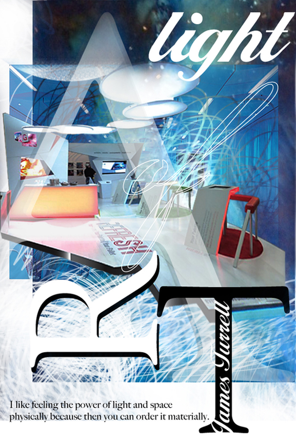 Light is not so much something that reveals, as it is itself the revelation: James Turrell Ancient architects and masters knew this. They created their temples that literally came alive during certain times of the year. Architecture and light are mutually dependent. The Italian architect, Bruno Zevi called “light as an architectural form”. Le Corbousier, the pioneer of modern high design held light to highest stature. He said “architecture is the learned game, correct and magnificent, of forms assembled in the light. ”. Dynamic design establishes a play of light and shade, and appropriate lighting commands the mood and the mind of your attendees. Again in the words of James Turrell: Light is a powerful substance. We have a primal connection to it. But, for something so powerful, situations for its felt presence are fragile. I form it as much as the material allows. I like to work with it so that you feel it physically, so you feel the presence of light inhabiting a space. I like the quality of feeling that is felt not only with the eyes. Trade show exhibitors and designers are well in-tuned with this quality of feeling. It is a guaranteed return on investment when it comes to the play of light and light projections. However, we are also painfully aware that it comes with a ticket value that screams "premium". Not any more! In recent years, event lighting has gained tremendous momentum and is forging ahead in the form of LED illumination and incandescent lighting. Event lighting allows anyone to add delightful rich color on any surface of your display, flooring and ceiling. Create a central theme throughout your space or define zones and boundaries. Use the infinite color combinations of the LED washers to enrich your hanging signs or your ceiling structures. Another, creative way to add form to your space is by adding pendant lights at varying levels. Create a sculptural definition to enhance the feeling of space. Transform the spatial context, create agreeable, sublime or mysterious sensations. Enlarge a space, make it smaller, or simply highlight aspects of the space that will interest your target audience. Have fun with it. More importantly, feel it. Touch the heart of your visitors with the effects of light. Your brand will gain vitality and a permanent residence in their memory! Articles you might like
|
Archives
September 2020
Categories
All
Don’t bend; don’t water it down; don’t try to make it logical; don’t edit your own soul according to the fashion. Rather, follow your most intense obsessions mercilessly. Franz Kafka |


 RSS Feed