|
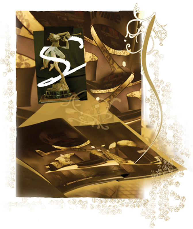
"S' curve is the age old crux of creative expression. I believe, the Ancient Greeks and the Romans brought into forefront the phenomenal "S" curve. It is related to and is an extension of the art term "contrapposto": when a figure is portrayed as slouching it shifts the center of gravity to one side. The body and posture is painted like a sinuous or serpentine "S". Richard Macdonald, the celebrated figurative artist is prolific with the "S" curves. He drives and rides on "S" curves. He is the inspiration behind this thought phenomena. In the 20th century the S-Curve emerged as a mathematical model and was afterwards applied to a variety of fields including physics, biology and economics. It describes for example the development of the embryo, the diffusion of viruses, the utility gained by people as the number of consumption choices increases, and so forth. "S" curves are used in abundance in trade show booth designs and in architectural spaces. In your next photo shoot use the imaginary "S" curve to compose a fluid story line. Articles you might like
0 Comments
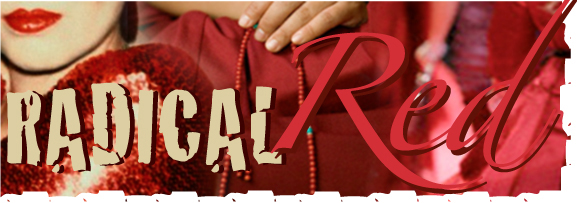
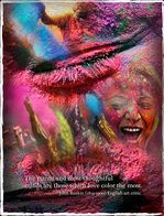
“Red", I write "is the color of life. It's blood, passion, rage. It's menstrual flow and after birth. Beginnings and violent end. Red is the color of love. Beating hearts and hungry lips. Roses, Valentines, cherries. Red is the color of shame. Crimson cheeks and spilled blood. Broken hearts, opened veins. A burning desire to return to white.” Mary Hogan Seated in high power red is ever passionate and intoxicating. Red is the prized mistress of the material seekers and the cardinal crutch of the Indian yogis. Red is the color of the root chakra. Red is supposedly the first color percieved by Man. Neolithic hunter peoples considered red to be the most important color endowed with life-giving powers. Red brings focus to the essence of life and living with emphasis on survival. Red is the highest arc of the rainbow. Red is the first color you lose sight of at twilight. Red is the longest wavelength of light. “Of all the hues, reds have the most potency. If there is one electric blue, a dozen reds are so charged. Use them to punctuate white, burn into bronzes, or dynamite black." – Jack Lenor Larsen Use red to command attention, to get people to act. Use red when you don't want to sink into the background. Collaborate with red to suggest movement, vitality and confidence. Combine multiple shades of red for a cheerful palette. Articles that you might like:
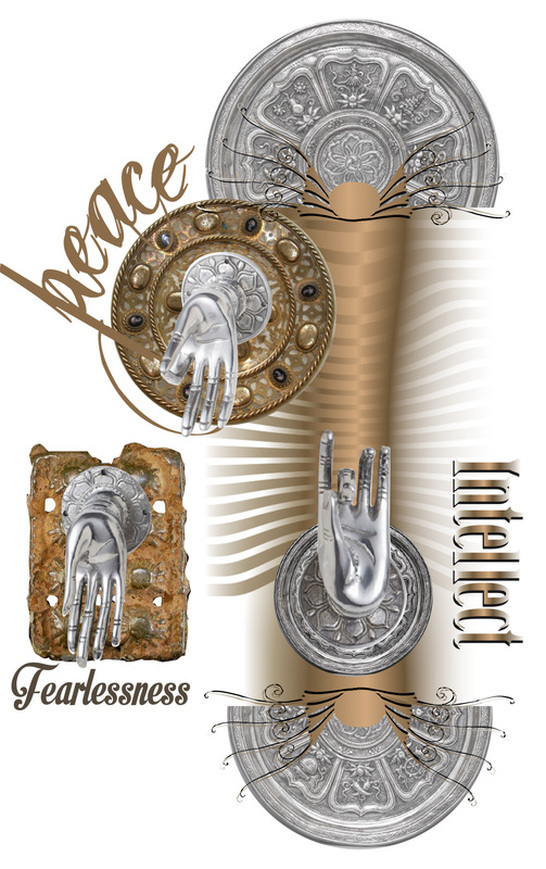
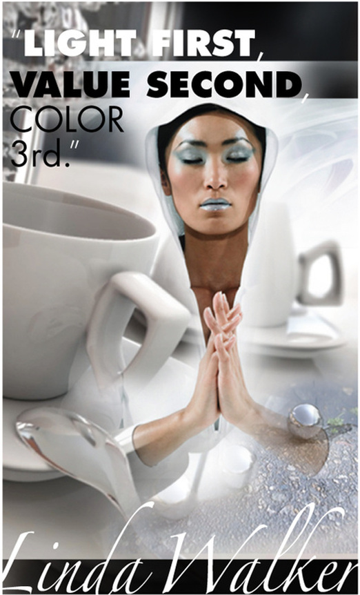
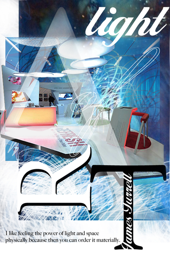
The light of our lives comes from the sun and other stars: a form of electric and magnetic energy. Photons of light travel through space behaving both like particles and waves. We see forms once light reflects off the object. Hence, light is the grand master of form and texture. It is by mastering this light we give birth to the essence of an object. The basic qualities of reflection or absorption of light are the elements to consider when designing any kind of handiwork. A glass will reveal its color when light passes through it. However when a glass is engraved or etched, light is trapped inside it. A silver object, when polished, reflects light and when hammered, will absorb light giving a completely different look and feel. A polished material has completely different and sometimes opposite connotations from a matte surface, a wide spectrum ranging from opulence to quiet elegance. Texture has boundless range of tactile and visual experiences. It is essential for us to understand their marriage with light in order to express and master the milieu. It is the materials and their finishes that we explore in our projects brings forth the uniqueness of each environment and celebrates the individuality of each object. "Texture and color in a mutually supporting discourse defines any creative artifact – waiting to be decoded its inner secrets and thereby enrich our perception and transfer it to whatever we choose." Articles you might like
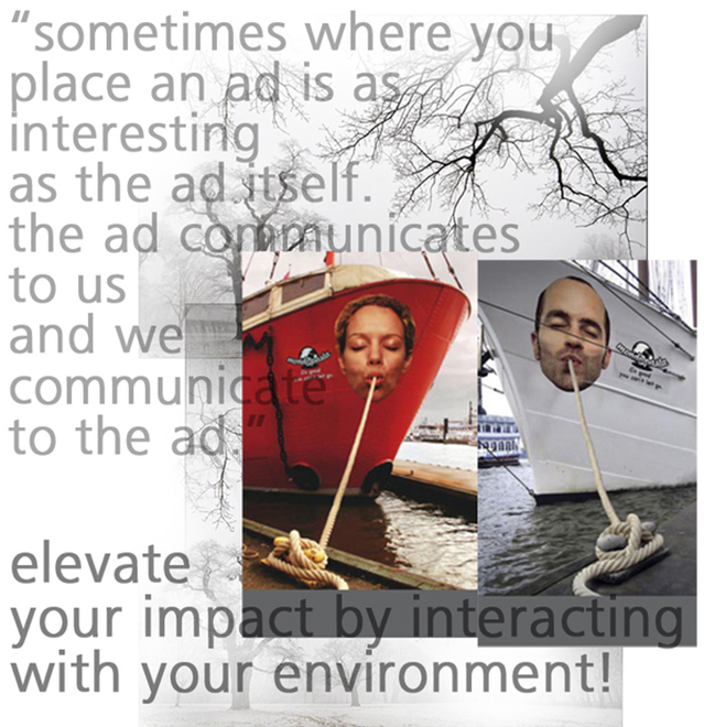
It is cold winter on the dock at Hamburg, Germany, with gaint ships and tankers swaying in the cold northern winds and sea birds circling the grey skies above. Not exactly the kind of place one would expect to experience experential ad marketing. This is larger- than-life ad that leverages the environment in which it is placed and it creates warm smiles on thousands of bundled-up tourists and residents passing by. Thanks to the immense creativity of German agency Jung von Matt, ropes that tied a few of the ships to the dock were transformed into pasta–hand-made Mondo Pasta, to be exact–and the ships themselves became happy pasta eaters. This interplay with the environment ehances the value proposition of the product in display. Next time, for your trade show or event marketing, please remember, how compelling of a reason it is to interact with your environment. Articles that might interest you
|
Archives
September 2020
Categories
All
Don’t bend; don’t water it down; don’t try to make it logical; don’t edit your own soul according to the fashion. Rather, follow your most intense obsessions mercilessly. Franz Kafka |



 RSS Feed