|
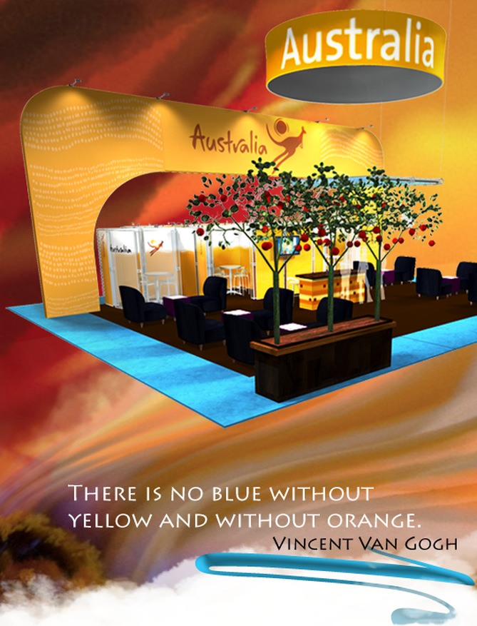
Color is a channel for non-verbal communication. It communicates to us at a cellular level. Zara Stender, chair holder with the Color Marketing Group (CMG) professes the power in color to influence moods, emotions, hunger, aggression—and buying decisions. “Color increases brand recognition by up to 80 percent, and it can be up to 85 percent of the reason people decide to buy,” as Stender mentioned in the Global Shop Conference 2012. Trade show exhibitors and designers use color to create a visually pleasing environment, and color used purposefully communicates with customers and prospects. To build a welcoming space, Stender recommended avoiding high-contrast colors—such as yellow and black, which she calls “danger colors”. Complementary colors, helps to balance the eye. However if you want to convey a message of subliminal concentrated focus use high contrast colors. Also important is to anchor the space in true neutral; which can be created by mixing the designs' entire palette and adding white. “Color is not only useful in designing a space, but also in knowing your customer,” Stender said. Interestingly, as Stender explains; color is correlated with socio-economic status, with more complex colors associated with higher economic status. For example an orange sports car will be referred as “bronze” or “copper.” Alternatively, primary colors are often associated with affordability. (Think the subliminal message that IKEA portrays) Of course, colors across cultures carry different meaning. For example the color purple signifies royalty and spirituality in the Greco-Roman culture of the West. However, purple is the color of mourning for widows in Thailand in some parts of India. On an individual level, Stender explained that introverts tend to gravitate toward soft, muted palettes, while extroverts are happier in vibrant environments. Using color strategically, designers can create a balance that plays into both of these personalities in any environment. “The earmark of an extrovert is that they can’t focus,” Stender said. “When dealing with them on a sales floor, blues can help them to focus.” An introvert, on the other hand, might be inspired by just the right proportion of color richness. Some color associations, according to Stender: Red: Lust (has the power to alter time) Yellow: Aggression Orange: Affordability Purple: Spirituality (inspires loss of impulse control) Brown: Dependability (especially in business) Blue and green: Focus and concentration Burgundy and dark green: Tradition and authority Red and purple: The “I’ll buy anything” color combination, according to Stender. “Red being lust—‘I wanna spend’—and purple being associated with loss of control.” Articles you might like
0 Comments
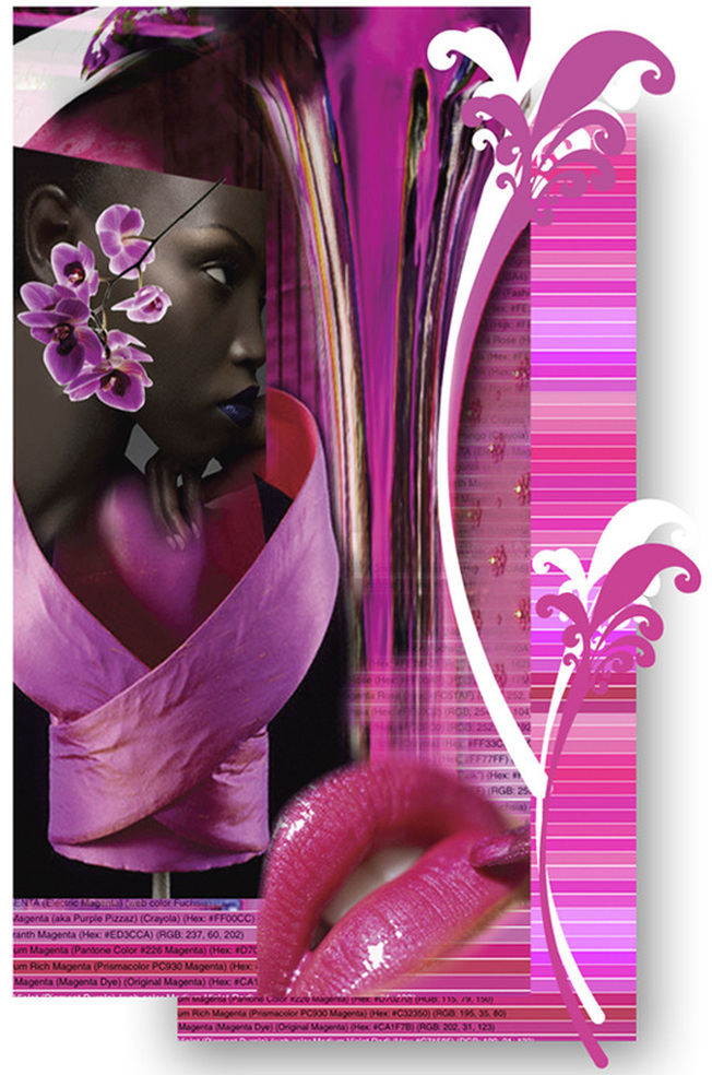
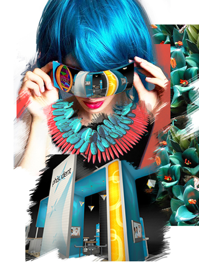
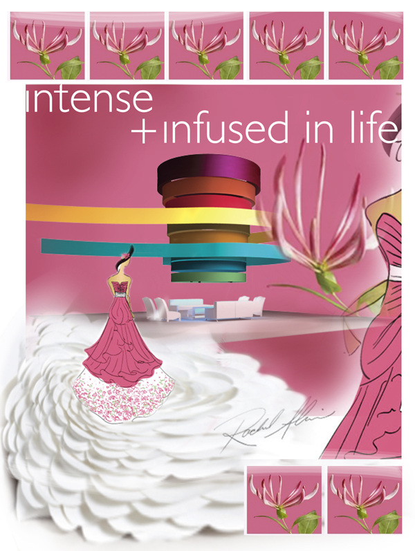
2011 promises to be radiant and floral. The world-renowned authority on color, Pantone Color Inc. states that 2011 will be honeysuckle hued. The color is from the magenta family, a violet pink of childish inventivenss. However, Pantone confirms: "A dynamic reddish pink, Honeysuckle is encouraging and uplifting. It elevates our psyche beyond escape, instilling the confidence, courage and spirit to meet the exhaustive challenges that have become part of everyday life." The company claims that while 2010 was all about Pantone 15-5519 turquoise and feelings of escape, 2011's honeysuckle tone will encourage us "to face everyday troubles with verve and vigor". It predicts we will see honeysuckle (Pantone 18-2120) in everything from women's clothes, cosmetics and accessories, to men's ties and shirts. The color will also flow to pillows, appliances and tabletop accessories and trendy trade show design booths. "In times of stress, we need something to lift our spirits. Honeysuckle is a captivating, stimulating, color that gets the adrenaline going, perfect to ward off the blues," said Leatrice Eiseman, executive director of the Pantone Color Institute. This trend in stimulating colors has taken off from the rich, intense and cultural colors that we see the market place oversaturated with. While brighter colors have lifted our spirit during the onset of tough economic times, they have an overt optimism that seems to be put of step with our everyday reality. Just as looking deep within us gives us the resolve to be determined, looking to colors that emerged as part of unique cultural heritage connects us to the strength of our ancient ancestors while blurring the boundaries between past and present. Today's attention getting hues coming on strong are tomato red, berry bright magenta, deep apricot, exotic coral and peacock blue.... Source: Sensational Color Articles you might like
Magenta doesnot exist in a single wavelength of white light spectrum. The magic lies in our brain. Magenta is the result of the magic that the brain performs when it constructs a color to bridge the gap between red and violet, because such a colour does not exist in the light spectrum. Unlike all the other spectrum colors, Magenta is the only color that has no wavelength attributed to it. This means that perception of color does not have a one to one correlation with the “third dmensional” world that we live in… Color happens in the brain and is experienced in the mind. Sir Isaac Newton first noticed magenta to be an extra-spectral color when he was playing with prisms. When he superimposed the red end of the spectrum on to the violet end, he saw magenta. Magenta is nonconformist. Magenta is intelligent and innovative, often manifesting as inventors of bizarre or controversial objects. Their imagination has no limits. It is the color of the free spirit. It is agile and assertive. It is imaginative and productive. It is bright, determined and dances to it's own tune. Use magenta to energize your brand. Use it for its vigor and verve. Magenta is the color of change and transformation. It releases old and outdated patterns to inspire growth and development. Be bold with magenta on product launches. Instill the assertiveness of magenta in your product design. Play with magenta at corporate events and trade show pavilions. Magenta is a confluence of opposition. As a strong and inspiring color magenta can appear outrageous and shocking on one hand or innovative and imaginative on the other. Use it to be inspired or manipurate it for creating shock and awe! Articles you might like
In Latin, December means the tenth month. History dictates that in 700 BC, the Roman King Numa Pompilius moved the beginning of the year from March and added January and February. From here on, the nameless dark stretch contributed to the 12 month Gregorian calendar as we now know.
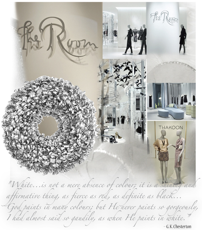
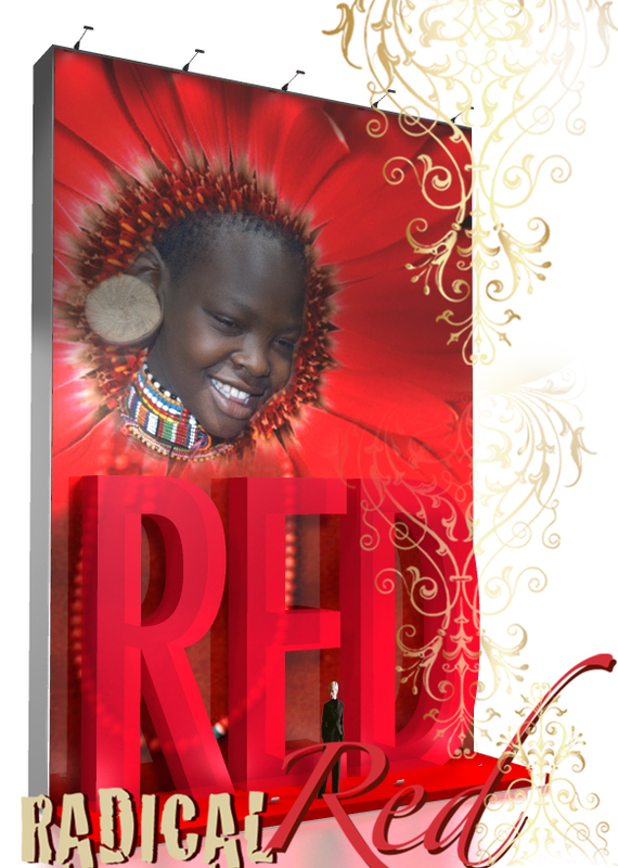
December to me, is the month of instrospection and reflection. It is a white canvas in waiting. White is the merging of all that it is. It is light. It aids mental clarity, evokes purification of thoughts and enables fresh beginnings. It is intellectual intelligence that requries us to go through such a period of "whiteness" before creativity manifests itself in the form yellow daffodils, in early spring. "The first of all single colors is white ... We shall set down white for the representative of light, without which no color can be seen; yellow for the earth; green for water; blue for air; red for fire; and black for total darkness."– Leonardo Da Vinci The Room gives us an exclusive experience in white. Designed by Toronto-based Yabu Pushelberg along with The Bay CEO Bonnie Brooks, the 1858 sqm space uses white as color base, punctuated by polished metal, glass, chandeliers and geometric curves to showcase its wares. The design changed and transformed the perception of space as we understand in retail. Launched in October of last year at a cost of $3.8 million, the refurbishment saw the doubling in size of the store’s iconic St Regis Room to create The Room. It now encompasses more than 70 high fashion labels and European lines, some of which are exclusive to The Bay. Smart, effective and timeless white ensures endurance and resilience–a key layer to any design classic! “Red", I write "is the color of life. It's blood, passion, rage. It's menstrual flow and after birth. Beginnings and violent end. Red is the color of love. Beating hearts and hungry lips. Roses, Valentines, cherries. Red is the color of shame. Crimson cheeks and spilled blood. Broken hearts, opened veins. A burning desire to return to white.” Mary Hogan Seated in high power red is ever passionate and intoxicating. Red is the prized mistress of the material seekers and the cardinal crutch of the Indian yogis. Red is the color of the root chakra. Red is supposedly the first color percieved by Man. Neolithic hunter peoples considered red to be the most important color endowed with life-giving powers. Red brings focus to the essence of life and living with emphasis on survival. Red is the highest arc of the rainbow. Red is the first color you lose sight of at twilight. Red is the longest wavelength of light. “Of all the hues, reds have the most potency. If there is one electric blue, a dozen reds are so charged. Use them to punctuate white, burn into bronzes, or dynamite black." – Jack Lenor Larsen Use red to command attention, to get people to act. Use red when you don't want to sink into the background. Collaborate with red to suggest movement, vitality and confidence. Combine multiple shades of red for a cheerful palette. Articles that you might like:
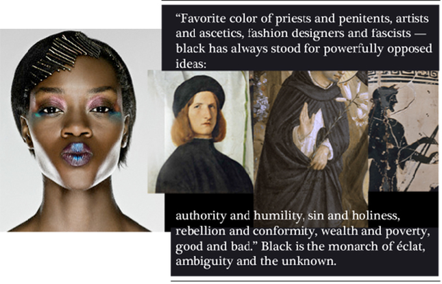
In this epoch of instant "sense-perience", I often turn to solitude and inner darkness. It is BLACK. Black is restful emptiness into which anything may emerge and disappear only to reappear again. It is being in a state of inherent potential and immense possibility. Black flourishes in opposites. "Favorite color of priests and penitents, artists and ascetics, fashion designers and fascists–has always stood for powerfully opposed ideas: authority and humility, sin and holiness, rebellion and conformity, wealth and poverty, good and bad." In his richly illustrated book, Black: The History of a Color, the acclaimed author Michel Pastoureau tells the fascinating social history of the color black in Europe. It is this book that inspired me to write this blog. In the beginning was black, Michel Pastoureau tells us. The archetypal color of darkness and death, black was associated in the early Christian period with hell and the devil but also with monastic virtue. In the medieval era, black became the habit of courtiers and a hallmark of royal luxury. Black took on new meanings for early modern Europeans as they began to print words and images in black and white. During the romantic period, black was melancholy's friend, while in the twentieth century black (and white) came to dominate art, print, photography, and film, and was finally restored to the status of a true color. A color never occurs alone; it only fully “functions” from the social, artistic, and symbolic perspectives, insofar as it is associated with or opposed to one or many other colors. Hence the example of the trade show booth design below, is a palette of opposites the all absorbing black and the reflective white. For Pastoureau, the history of any color must be a social history first because it is societies that give colors everything from their changing names to their changing meanings–and black is exemplary in this regard. Black has always been a forceful and ambivalent–shaper of social, symbolic, and ideological meaning in our societies.
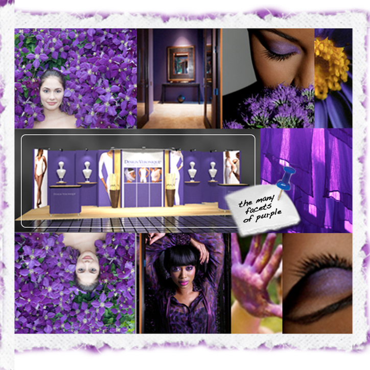
Michel Pastoureau is a historian and director of studies at the École Pratique des Hautes Études de la Sorbonne in Paris. On the shoulders of giants like you we rest, we dream, we aspire and we thrive. Thank you. Dictionary defines purple as “any of a group of colors with a hue between that of violet and red” and as a “symbol of royalty or high office.” Historically, the color purple has been associated with royalty, power and mysticism. Being the color in between red and blue, purple commands a dynamic presence when used in large areas. In nature, purple, generally appears as flower petals, like lilacs, lilies and lavenders. In the human domain it the color of royalty and mysticism. The color purple can trace it's history back to the Minoan civilization in Crete, about 1900 B.C. The ancient land of Canaan (its corresponding Greek name was Phoenicia, which means “land of the purple”) was the center of the ancient Phoenician Tyrian purple. The color, most prized in the ancient world, was extracted from the hypobranchial gland of Purpura mollusk (hence its name). This is how the math adds up: it took 12,000 shellfish to extract 1.5 grams of the pure dye. Fast forwarding to the 21st century, deep purple is used in marketing efforts, advertisements and labels as it is perceived a higher-quality product. This is especially true in European markets as they have a long tradition of monarchies. Indulge in the sensations of purple and ponder if purple should be part of your palete for your next project. Articles you might like
|
Archives
September 2020
Categories
All
Don’t bend; don’t water it down; don’t try to make it logical; don’t edit your own soul according to the fashion. Rather, follow your most intense obsessions mercilessly. Franz Kafka |











 RSS Feed