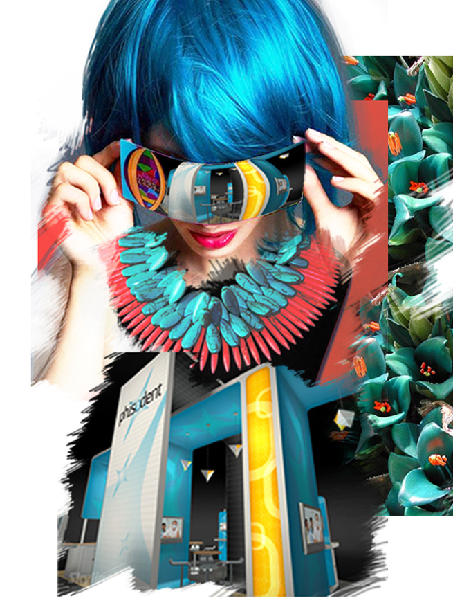
 I believe, Goethe was the first man to challenge Newton's theory of light and color based exclusively on physical phenomenon. He was the first one to point out that color sensations interacting with our brain cells are based not on the principle of optics but more so on our perceptions of our primal emotions. In his color teachings, Goethe called the color blue a “delightful nothing”. Blue is pleasant, because “it doesn’t press us, but only lingers”; it gives a feeling of boundlessness and space. The ancient Greeks acknowledged blue to be nothing of material origin; "a color of perspectives, ethereal as the color of the sky, the ocean, the shadow of the moon, the unreal." Hence, it is no surprise that blue is the overwhelming favorite brand color. It conveys dependability and consistency in a business world that is anything but consistent. When brands are expressed in the experiential visual market place like trade shows; it is also no surprise that blue is the safest color of choice. Safe but not sure. A close relative of blue is turquoise. It renders the peace, calm and stability of blue; balance and growth of green and the stimulation of yellow. Turquoise recharges our spirits and grounds us during times of high sensory overload. It assists in the development of organizational and management skills. It is a silent influencer rather than a demanding look at me. Hint: Pepper your communication areas with this color. Balanced between the extremes of red and violet, turquoise is the color of equilibrium between our emotions, thoughts and speech. Turquoise is a friend of public speakers as it calms the nervous system, gives control over speech and expression, and builds confidence. Hint: Design your stage area with turquoise overlays. The very least: print your speech notes on turquoise. You will feel the stabilizing effects of this color every time you glance at it. Turquoise hoists the levels of creativity and sensitivity. With confidence it forges ahead; balancing the pros and cons, the right and wrong, of any situation. Hint: Use it in showcasing your existing products or to highlight a new product. Play with the variations of turquoise to exhibit an environment of strength, triumph and poise. Use aqua for re-freshing strength, aquamarine for dynamic exhilaration and sophisticated teal for age old commitment. Turquoise is ideal for both the male and female audience of all ages. Combine with red, orange or yellow for targeting the active, male principle. Flavor it with soft pink, lavender or pale lemon for the female form ideal for the fashion industry. Coming from a culture of brilliant technicolors, I am eternally fascinated by its diverse dimensions. I share with you as I learn more and more of it. However, the inspiration for this write up comes from White Oleander. “She would be half a planet away, floating in a turquoise sea, dancing by moonlight to flamenco guitar.” Emotions so richly experienced by weaving nouns and verbs.....The clutch of colors in our collective psyche! Articles you might like
0 Comments
Leave a Reply. |
Archives
September 2020
Categories
All
Don’t bend; don’t water it down; don’t try to make it logical; don’t edit your own soul according to the fashion. Rather, follow your most intense obsessions mercilessly. Franz Kafka |
 RSS Feed