|
We are inherently creative. Yet some times we are paralyzed by our own critical thinking that brings our creativity to a jolting halt. We manage to strangle the flow. Creative thinking is crucial when we are trying to solve a tough problem, when we are presenting a solution for a brand make over or when we are giving birth to a new brand. The trick is I believe, to change the perspective and see things from a different vantage point than currently do. The popular adage "think out of the box" is what we like to talk about. However, the reality is you still have to reside within the "box" to be accepted within the "existing paradigm": all you have to to do is make the box fluid; meaning you define the parameters of the box. I love the Japanese concept of kaizen. It is the idea that big changes occur not through a one time big action but through the accumulation of thousands of tiny little actions. What is so cool about this concept is that it fools the brain into thinking that you are not faced with any challenge. Our evolution dictates that when we are faced with a challenge the neo-cortex or the higher thinking brain shuts down and the primitive reptile brain takes over. And, when the amygdala takes over you shoot down the ability to do any kind of creative problem solving. You are operating on a fight or flight reptilian level. The key to hacking your brain is to get into the discipline of doing something creative, however insignificant it might be. After all, it took 10,000 experiments before the incandescent light bulb was manifested. Here are 10 mental blocks that we set up for ourselves. Sounds familiar? 
0 Comments
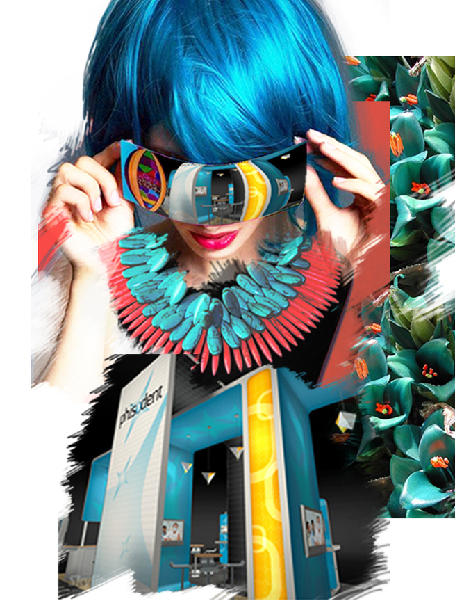
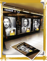
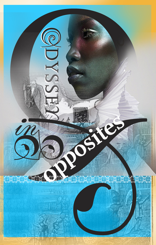
 During the launch of Levi's Curve ID jeans in 2010, Levis launched a 5 week integrated marketing campaign that touched on experiential marketing, social media and outdoor events in shopping malls and city centers throughout the UK. Brand ambassadors for Levi's encouraged women to find their perfect curve jeans shape in-store for the chance to win a £1000 Levi's shopping spree. The idea behind the campaign was to drive long-term engagement with the brand and needless to say it was a stroke of marketing genius that has been reaping phenomenal results. Curves are emotionally and architecturally very captivating. It inspires us to excel in elegance and balance. It is the defining stroke of our postmodern age. In this age of hyper-modern minimalism, we frequently encounter sweeping curves, blended complex geometry, bold colors and inherent playfulness. Curves takes it lesson from nature; perhaps that is the reason why curves are deep seated in human consciousness. They’re smooth, refined, and pleasing to the eye. It dominates the organic world: the curve of the clouds, the gently sloped mountains, the rolling waves of the sea, the female body. Curves add the feminine softness and tricks the eye into seeing something beyond. It unites the space in an harmonious rhythm. Incorporate the flooring of your booth design to mirror the curves in the architecture above. It gives the illusion of a bigger environment. Contrast your angled booth design with the curves of the furniture. By doing so, your space attains symmetry and resonates with the audiences of both sexes. As the Irish novelist, James Joyce so skillfully said “Men are governed by lines of intellect - women: by curves of emotion". At the end of the day, it is all about memorability. It is worth keeping in mind: people will soon forget about your jazzy marketing pitch but the intangible force of your brand will be deep embedded in their sub-conscious! Articles you might like
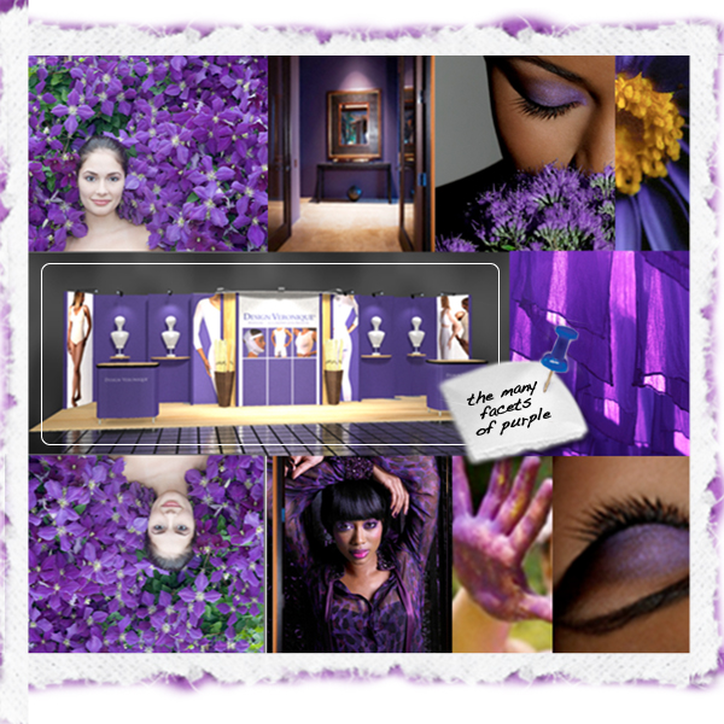
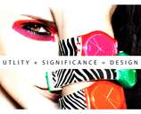
 Color is a channel for non-verbal communication. It communicates to us at a cellular level. Zara Stender, chair holder with the Color Marketing Group (CMG) professes the power in color to influence moods, emotions, hunger, aggression—and buying decisions. “Color increases brand recognition by up to 80 percent, and it can be up to 85 percent of the reason people decide to buy,” as Stender mentioned in the Global Shop Conference 2012. Trade show exhibitors and designers use color to create a visually pleasing environment, and color used purposefully communicates with customers and prospects. To build a welcoming space, Stender recommended avoiding high-contrast colors—such as yellow and black, which she calls “danger colors”. Complementary colors, helps to balance the eye. However if you want to convey a message of subliminal concentrated focus use high contrast colors. Also important is to anchor the space in true neutral; which can be created by mixing the designs' entire palette and adding white. “Color is not only useful in designing a space, but also in knowing your customer,” Stender said. Interestingly, as Stender explains; color is correlated with socio-economic status, with more complex colors associated with higher economic status. For example an orange sports car will be referred as “bronze” or “copper.” Alternatively, primary colors are often associated with affordability. (Think the subliminal message that IKEA portrays) Of course, colors across cultures carry different meaning. For example the color purple signifies royalty and spirituality in the Greco-Roman culture of the West. However, purple is the color of mourning for widows in Thailand in some parts of India. On an individual level, Stender explained that introverts tend to gravitate toward soft, muted palettes, while extroverts are happier in vibrant environments. Using color strategically, designers can create a balance that plays into both of these personalities in any environment. “The earmark of an extrovert is that they can’t focus,” Stender said. “When dealing with them on a sales floor, blues can help them to focus.” An introvert, on the other hand, might be inspired by just the right proportion of color richness. Some color associations, according to Stender: Red: Lust (has the power to alter time) Yellow: Aggression Orange: Affordability Purple: Spirituality (inspires loss of impulse control) Brown: Dependability (especially in business) Blue and green: Focus and concentration Burgundy and dark green: Tradition and authority Red and purple: The “I’ll buy anything” color combination, according to Stender. “Red being lust—‘I wanna spend’—and purple being associated with loss of control.” Articles you might like
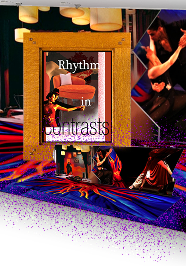
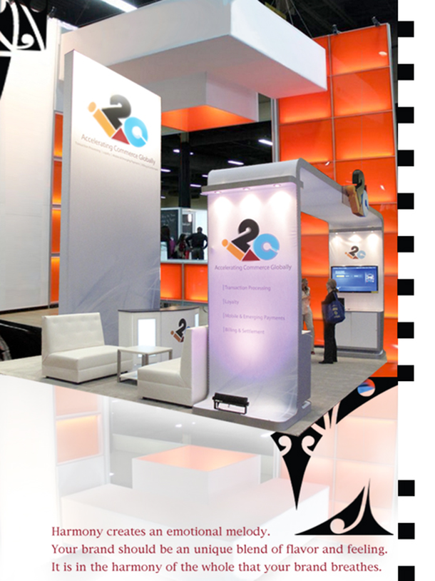 "Always aim at complete harmony of thought and word and deed." (Mahatma Gandhi). To this wise adage if I may add, aiming harmony in design is crucial; I do not think I will be too far off. Harmony pulls the pieces of visual elements together. It drives at achieving visual rhythm at trade shows; notoriously known for clutter and chaos. Adjacent colors, related textures, similar shapes and of course the golden ratio are the principal attributes in fostering balance and congruity. Start with a limited color palette. Use tonal contrast as the key element to emphasize focal point. You might want to play with formal balance or an informal balance for the overall movement. If the sentiment of your brand is dignified, restraint and conservative you might want to go with formal balance. Elements on the right side of your display mirrors the left side in size, placement, shape, and color. Usually banks and retail sector might go with this kind of a structured layout. If the brand is conceived as exciting and playful, informal balance is the way to go. There is imagination, randomness and discovery at play here. If you wish to promote activity, excitement, and variety use informal balance but nevertheless there needs to be some kind of connective tissue that unifies your exhibiting space. Harmony in your booth design is bound to amplify the voice of your brand. If some contrast is weaved in this spatial harmony it makes the brand exciting and memorable. Understatement is always better. Sometimes a tiny bit of contrast is all that you need. Be it flooring, lighting or perhaps interjecting some curvacious furniture is all that you need. The principles of harmony and contrast may seem completely contradictory, but it is the fine balance between these two that dictates the dominance of brand. Articles you might like
 We are Digital Citizens in an Age of Digital Commerce. We would rather do business from the comforts of out own home and tweet about the cheapest gas price of the day. We have evolved into Digital Consumers. Research shows that recommendations from friends and colleagues hold higher weight in the digital world specially amongst Generation X, Y and Z, more so than high-flying paid advertisement. Very soon Facebook and, increasingly, the Pinterest pinning site will be major forces in driving online sales and digital validation. In response to this diverse multi-generational needs "nimble" and "flexible" are the coveted words in environment design. For example, new retail store features dressing rooms that can be moved to make way for fashion shows, moveable floor fixtures that tuck away for in-store concerts and DJ booths that pop up behind cashwraps. “The integration of digital commerce across all channels of customer engagement allows for the opportunity of enriched, broader, more diverse and more animated assortments in smaller stores,” says Jack Hruska, executive vice president, creative services for New York based Bloomingdale’s Inc. “It is one of the key trends I see going forward. The challenge is to be a fantastic curator, so as to target the right customer and not overwhelm her with too many decisions, and always stay true to ones’ brand DNA.” If you are a trade show marketer, it is safe to say that the larger portion of yur target audience will comprise of Baby Boomers, Gen X and some Gen Ys. According to experts here are some marketing tacts to reach effectively to these very distinctive audience. 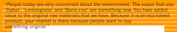 Marketing to the Baby Boomers The Boomers value individualization, self-expression, optimism, and “Be Here Now.” They want quick fixes that require little change and instant improvement. Focus on building value. They will be less price sensitive if they believe they are getting a superior product and good value. Boomers prefer open and direct but not controlling body language and communication. Questions should be answered thoroughly. It is good to take the time to explain how doing business with your organization can give them a competitive or positive advantage. Realize that more information is better for Baby Boomers. Use positive, emotionally meaningful concepts, words, and images. Paint a visual story. Marketing to Generation X Multiculturalism and global thinking is the norm of this generation. This generation has produced the 1990’s dot.com stars. They are highly educated even though they are pessimistic, skeptical, disillusioned with almost everything, and questions conventionality. They like initiatives that will make things more useful and practical. Give them a lot of stimuli, a challenging environment, and flexibility without long-term commitment. They demand trust to the extent that if your organization does not follow through once, then you are likely to lose them. They have a reputation of being incredibly disloyal to brands and companies. Generation X wants to hear the features of the product and how it will benefit them. This group is the most price conscious. They perceive products as commodities, unless the products and messages are designed uniquely for their tasks and lifestyles. Give them plenty of access to information and educate them into buying. Always ask their feed-back. They like to be kept abreast of the bigger picture. Use short sound bites to keep their attention. Do not use overly slick marketing pitches as they are skeptical of modern advertising. Be frank and use straightforward facts, candor, and honesty. Xers think communally and make decisions together. Make good use of social media, group events and word-of-mouth recommendations from their peers. Interestingly, they respond to direct mail. Marketing to Generation Y Gen Y individuals are well grounded and wise for their age. Eight key values have been described for Gen Y: choice, customization, scrutiny, integrity, collaboration, speed, entertainment, and innovation. Be sure that they know that your organization’s mission speaks to a purpose greater than the bottom line, e.g., globalization, global warming, and the advent of the “global citizen.” Feature your organization as an instrument of change. Give them systematic feedback because they value positive reinforcement at accelerated rates compared to previous generations and want more input into all things in which they participate. They value and are looking for brands that resonate with their peers. Their peers often guide product and brand choice. Generation Y is tremendously image driven. Take full advantage of technology and its allure for Gen Y. The key words for Gen Y are collaborate, connect, co-create, and control…mostly, with their peers. Gen Y pays little attention to quality. They expect competitive pricing. However, they are most likely to purchase prestige products.  Given the diverse topography that we are in, marketers of all mediums have to factor in the different characteristics and behaviors of the cross-generations, to build relationships, gain trust, and close business. In fact, creating ageless multi-generational brands is one of the top ten marketing trends over the next 25 years. However, all these generations have one common touch point. Provide them with a holistic experience of a life time and they are guaranteed to follow the the path of your brand loyalty. Sources: Himmel, B. (2008), “Different Strokes for Different Generations,” "Marketing to the Generations" Kaylene C. Williams, California State University, Stanislaus Robert A. Page, Southern Connecticut State University Langford, P. (2008), “Gen Y or Boomer, They Think the Same” Cohen, A.M. (2009), “The Emergence of a Global Generation” Zaslow, J. (2009), “The Greatest Generation (of Networkers)” Articles you might like
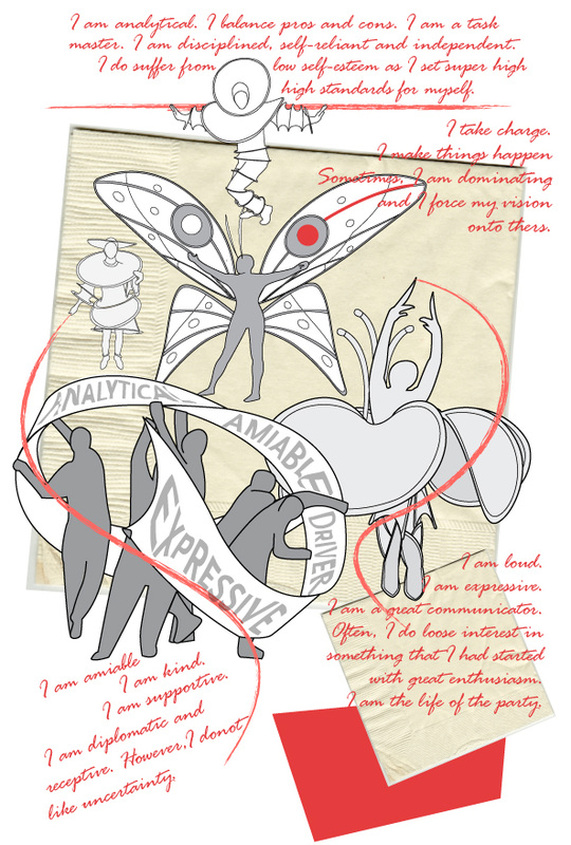 "An emotion occurs when there are certain biological, certain experiential, and certain cognitive states which all occur simultaneously." John D. Mayer: From EQ Today, Spring 1999 Emotional intelligence plays a dominant role in our daily lives. It goes on an over-drive in an experiential setting such as events and trade shows where we are subjected to massive sensory overdose. In such a setting if you are an exhibitor or a presenter you have to maintain a state of steady self-awareness. You have to perceive your emotions in real-time and use this awareness to stay flexible and act positively to direct your behavior, sometimes under challenging circumstances. This skill to sustain and direct your own feeling will enhance your ability to accurately pick up on emotions in other people and understand what is really going on. You will be able to monitor others' mood and temperaments and enlist this knowledge in predicting their future behavior and decision making, giving you an edge in the negotiating lounge. After all, that is all face-to face marketing is. Isn't it? Perception, Reason, Understanding and Management are the 4 keys to unlock emotional intelligence as modeled by Peter Salovey and John D. Mayer. It is also interesting to note that there are 4 different personality types. Like 4 seasons, human personality broadly fall under 4 quadrants. Different psychologist have labeled them under different names. The one that resonates with me is the science of D.I.S.C. Published in 1928 by psychologist William Moulton Marston and the original behaviorist like Walter V. Clarke and others, the science of D.I.S.C is used across the horizon to study human behavior in any given environments. D: DOMINANCE, I: INFLUENCE, S: STEADINESS, C: COMPLIANCE DOMINANCE: "This is the element of an individual’s personality that indicates competitiveness, drive and a desire to win. Highly dominant people tend become angry more often than lower dominant types. Dominance is a task oriented trait so once a highly dominant person takes on a task, they become determined to see it through to the end. These people often appear to be stern and severe. Once they have had an angry outburst, they forget the source of their anger quickly and move on to other things. Highly dominant people will often be seen as intimidating by others." INFLUENCE: "This is the element of an individual’s personality that indicates optimism, trust, and a sense of humor. Highly influencing people tend to joke around a lot, talk a lot, and use other people to get what they want out of life. Almost completely people-oriented, they need to be in the company of other human beings as often as possible. Highly influencing people like .... virtually anything they can show off. They are optimistic to a fault and trust almost everyone a little too much. Highly influencing people will often be seen as the life of the party by others." STEADINESS: "This is the element of an individual’s personality that regulates the pace at which they do things. Highly steady people tend to hold off on decision making until they believe the decision is the right one. They like to do research and get the approval of others before they do almost anything. They are people-oriented and will usually be very sociable with everyone they meet. Highly steady people will take longer to do their work, but because they are very thorough, the work they do is generally of very high quality. COMPLIANCE: "This is the element of an individual’s personality that creates a need for rules and regulations in their lives. Highly compliant people tend to approach every challenge or project with caution and concern. Because they are task oriented, they tend not to fall for a sales pitch that is not accompanied by facts and figures. Of course, we are a blend of the above, just the proportions vary. However, the key to remember is that there are certain experiences that exalts us while others irritates us. One thing is for certain. The unique blend of the head and the heart will give you an edge in the competence of social marketing. Articles you might like
It is a striking irony that in a bio-diverse planet such as ours we thrive on the competitive herd mentality of trying "to fit in". We like to play it safe. We like to trod the path that have been traveled ten thousand times. We have forsaken the imaginative spirit of David Livingstone to be "the creatures of the commonplace, the slaves of the ordinary". The best we can do is "new and improved" of the same old stuff. For example, the daily staple jeans: we have a choice of high rise, low rise, classic rise, boot cut, straight cut, wide leg, skinny flair and more of the same. In vain, we do not think about fabricating jeans that will interact with the atmospheric conditions to provide optimum wearing experience. The technology is there yet the imagination and the capital to take it to this level is sure lacking!   In this terrain of sameness, Harvard Business School professor Youngme Moon strikes out as an evangelist of "Difference". Her message is elementary. Yet it is the key to survival in the post-modern era of Globalization 4.0. "In category after category," she writes, "companies have gotten so locked into a particular cadence of competition that they appear to have lost sight of their mandate–which is to create meaningful grooves of separation from one another. Consequently, the harder they compete, the less differentiated they become ...Products are no longer competing against each other; they are collapsing into each other in the minds of anyone who consumes them." In her new book "Different" she talks about successful companies and leaders don't just try to out compete their rivals at the margin. Instead, they aspire to redefine the terms of competition by embracing one-of-a-kind ideas in a world filled with me-too thinking. Companies should be in the business of what Professor Moon calls "idea brands," products and services that challenges the very concept to its' core. Cirque du Soleil is an idea brand, a circus that re-engineered the concept of mechanical, acrobatic performance into orchestrated rhythm of art and story telling. So is Harley-Davidson, which invented the idea of high-nosed, mid-aged, white-collar, weekend "biker outlaw." So is Skyine's Arrive. It re-defines the idea of trade show portability by packing a whole 10'x10' display unit into one carrying case. And so is Dove soap, whose Campaign for Real Beauty challenged the preconceived notion of fashion and style. If you want to be the idea behind the "idea brands" ask yourself: If your company went out of business tomorrow, would anybody really miss it? –as the advertising legend Roy Spence would say. Or one might say, are your bags of goods and services so distinctive that it has become seamless to the consumer experience. Very few companies can vouch for it. This is why so many companies feel like they're on the verge of going out of business. Here is the key question to ask: If you are doing things the same old way, selling same old stuff, what would prompt you to do any different? The cardinal point to remember: Being different is the ROI of memorability. Articles you might like
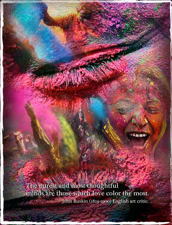
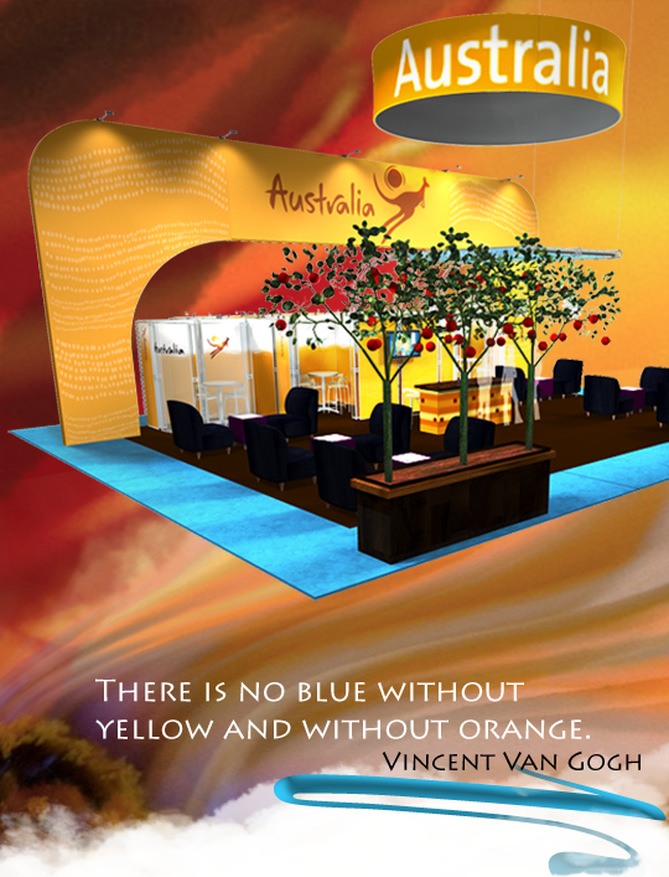
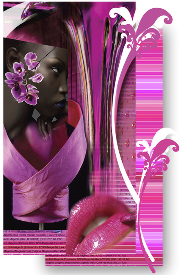
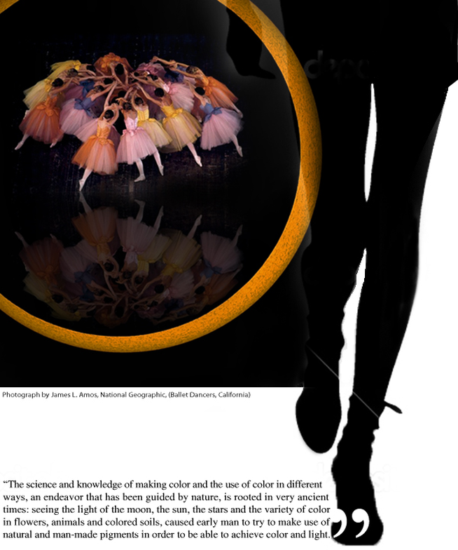
 I believe, Goethe was the first man to challenge Newton's theory of light and color based exclusively on physical phenomenon. He was the first one to point out that color sensations interacting with our brain cells are based not on the principle of optics but more so on our perceptions of our primal emotions. In his color teachings, Goethe called the color blue a “delightful nothing”. Blue is pleasant, because “it doesn’t press us, but only lingers”; it gives a feeling of boundlessness and space. The ancient Greeks acknowledged blue to be nothing of material origin; "a color of perspectives, ethereal as the color of the sky, the ocean, the shadow of the moon, the unreal." Hence, it is no surprise that blue is the overwhelming favorite brand color. It conveys dependability and consistency in a business world that is anything but consistent. When brands are expressed in the experiential visual market place like trade shows; it is also no surprise that blue is the safest color of choice. Safe but not sure. A close relative of blue is turquoise. It renders the peace, calm and stability of blue; balance and growth of green and the stimulation of yellow. Turquoise recharges our spirits and grounds us during times of high sensory overload. It assists in the development of organizational and management skills. It is a silent influencer rather than a demanding look at me. Hint: Pepper your communication areas with this color. Balanced between the extremes of red and violet, turquoise is the color of equilibrium between our emotions, thoughts and speech. Turquoise is a friend of public speakers as it calms the nervous system, gives control over speech and expression, and builds confidence. Hint: Design your stage area with turquoise overlays. The very least: print your speech notes on turquoise. You will feel the stabilizing effects of this color every time you glance at it. Turquoise hoists the levels of creativity and sensitivity. With confidence it forges ahead; balancing the pros and cons, the right and wrong, of any situation. Hint: Use it in showcasing your existing products or to highlight a new product. Play with the variations of turquoise to exhibit an environment of strength, triumph and poise. Use aqua for re-freshing strength, aquamarine for dynamic exhilaration and sophisticated teal for age old commitment. Turquoise is ideal for both the male and female audience of all ages. Combine with red, orange or yellow for targeting the active, male principle. Flavor it with soft pink, lavender or pale lemon for the female form ideal for the fashion industry. Coming from a culture of brilliant technicolors, I am eternally fascinated by its diverse dimensions. I share with you as I learn more and more of it. However, the inspiration for this write up comes from White Oleander. “She would be half a planet away, floating in a turquoise sea, dancing by moonlight to flamenco guitar.” Emotions so richly experienced by weaving nouns and verbs.....The clutch of colors in our collective psyche! Articles you might like
 The fact that Pinterest in now the third most popular social media site, beating Linkedin and Tumblr tells us something about the contemporary mass psychological movement. We are in the Age of Visual Content Revolution. Visuals have become the greatest crutch in the continuity of story telling. Ford, IBM, GE just to name a few have made the transition from stogy boardrooms to being active participants in this mass upheaval of ideas and culture. For artists designers and the creative folks, story boards and visuals were always part of the DNA. Now, visuals are grasping hold of marketers from different industries and they are realizing the forcefulness of visual marketing. Visuals make your Brand Fluid! Visual content draws upon your brand heritage and legacy. It helps in the story telling of your brand. For example, the new Facebook timeline is set up for companies to have opportunity to share their history visually, like Coca-Cola has done below. 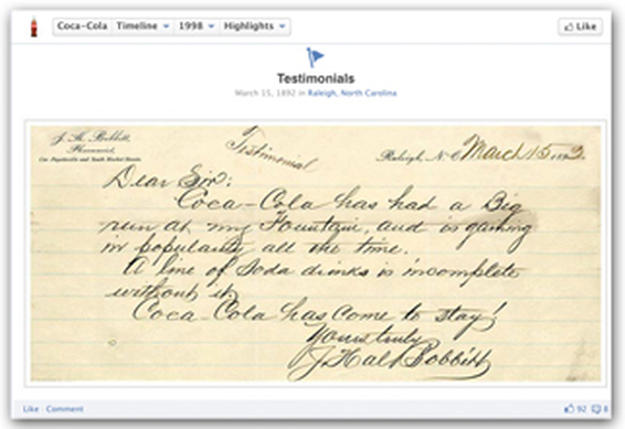 Brands like Starbucks, harnesses the power of social media to demonstrate what is going on behind the scenes between employees and customers. This humanizes the brand and promotes brand loyalty and awareness between companies and consumers. They have used visuals to make a powerful statement about their brand's stance on important issues that they believe in. Visuals make your Brand Captivating! Visuals capture more than just attention – they capture your heart and drives engagement. In fact, just one month after Facebook introduced timeline for brands, Simply Measured reports that engagement is up 46% percent per post, and visual content (photos and videos) have seen a 65% increase in engagement. Kudos to GE. They have proactively asked for fans to engage with the photos of their products, and the results are phenomenal! Now you know why status updates is loosing the battle to visual updates. Visuals make your Brand User-Worthy! If your customers are on at least a couple of the visually-friendly social networks like Facebook, Pinterest, YouTube, or Instagram, get them involved in helping shape the story of your brand in a more visual way. Keep in mind that there are multiple industries in which prospects won't make a purchase without first consulting user-generated content. That is the reason perhaps why Dunkin Donuts is encouraging fans to create visual content that gets them excited about their product. Referral traffic from social media sites to brand websites is on the rise. Shareaholic study revealed Pinterest generates more referral traffic than Google+, YouTube and LinkedIn combined; only Facebook and StumbleUpon generate more. Bottom Line: Social networks are a direct link to how customers get to your actual website. When brands are communicated through visual mediums, customers are then taking the next step and going directly to your website. No matter how boring the business of goods that you are in; give it a visual flair, weave a story, include your target audience to participate. And, simply watch how your brand evolves. Articles you might like
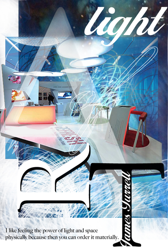 Light is not so much something that reveals, as it is itself the revelation: James Turrell Ancient architects and masters knew this. They created their temples that literally came alive during certain times of the year. Architecture and light are mutually dependent. The Italian architect, Bruno Zevi called “light as an architectural form”. Le Corbousier, the pioneer of modern high design held light to highest stature. He said “architecture is the learned game, correct and magnificent, of forms assembled in the light. ”. Dynamic design establishes a play of light and shade, and appropriate lighting commands the mood and the mind of your attendees. Again in the words of James Turrell: Light is a powerful substance. We have a primal connection to it. But, for something so powerful, situations for its felt presence are fragile. I form it as much as the material allows. I like to work with it so that you feel it physically, so you feel the presence of light inhabiting a space. I like the quality of feeling that is felt not only with the eyes. Trade show exhibitors and designers are well in-tuned with this quality of feeling. It is a guaranteed return on investment when it comes to the play of light and light projections. However, we are also painfully aware that it comes with a ticket value that screams "premium". Not any more! In recent years, event lighting has gained tremendous momentum and is forging ahead in the form of LED illumination and incandescent lighting. Event lighting allows anyone to add delightful rich color on any surface of your display, flooring and ceiling. Create a central theme throughout your space or define zones and boundaries. Use the infinite color combinations of the LED washers to enrich your hanging signs or your ceiling structures. Another, creative way to add form to your space is by adding pendant lights at varying levels. Create a sculptural definition to enhance the feeling of space. Transform the spatial context, create agreeable, sublime or mysterious sensations. Enlarge a space, make it smaller, or simply highlight aspects of the space that will interest your target audience. Have fun with it. More importantly, feel it. Touch the heart of your visitors with the effects of light. Your brand will gain vitality and a permanent residence in their memory! Articles you might like
|
Archives
September 2020
Categories
All
Don’t bend; don’t water it down; don’t try to make it logical; don’t edit your own soul according to the fashion. Rather, follow your most intense obsessions mercilessly. Franz Kafka |


 RSS Feed