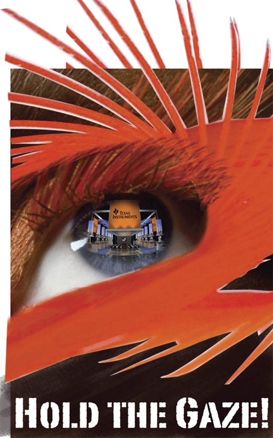
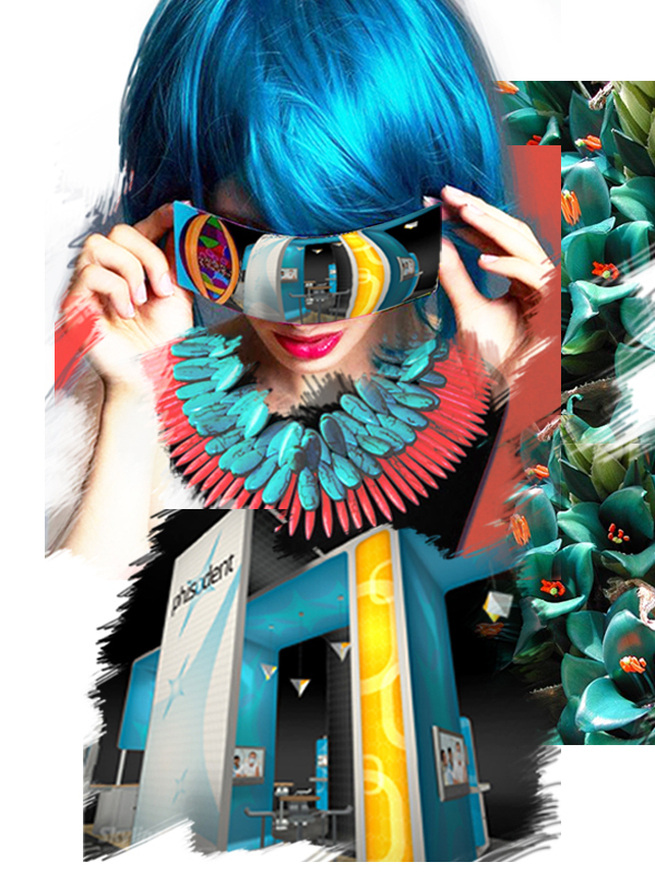
 With search engines, media portals and social networking sites cluttered with dozens of links and banners ads and magazines scattered with inserts and advertorials, how do we break through the clutter to grab the attention of consumers? Increasingly, the long lost science of tracking eye movements is coming back in vogue as markets figure out how to make eye contact with their target customers. Eye tracking first appeared more than 100 years ago. It measures a person’s gaze toward a screen, a page or 3D space [trade shows, events and exhibitions] to record what they look at (and don’t look at) and for how long, providing valuable data on customer behavior. For many years the most consistent way users viewed pages according to eye tracking tests, was in an “F” pattern (also known as the “golden triangle”). This means that viewers first looked at the upper left corner, then scanned down and over in a consistent pattern. But recent evidence shows that the "F" pattern has made the transition to an "E". Gord Hotchkiss, president of Enquiro and a columnist for MediaPost.com’s Search Insider, conducted some research only to find out some unexpected discoveries that run counter to the classic “F” conclusion. Hotchkiss’ research revealed that more people are viewing online content in an “E” pattern. They start by looking at graphics in the middle of the page first and then follow the copy up and down from there. And though bigger images were better at grabbing attention, this rule was still true even when small thumbprint images were used. If this is true for online page viewing imagine the effect of "E" in a 3D space design. Simple, large, mural is the key to holding viewer gaze. Below are tips on how to make the most of this field of study. Keep it simple. Keep it real. Viewers are instinctively drawn to human faces and there’s growing evidence that “real people” rather than professional models are more likely to keep their attention. And Not too colorful. Eye tracking research has shown that black, white, red, yellow, blue and green (primary colors) are the most likely to get noticed [online]. Eye tracking is a subtle science yet the minor movements it follows can have a major impact on how your content is received. By incorporating these ideas into your creatives you may be able to influence where a viewer’s gaze not only begins, but where it holds, and that could make all the difference. Articles you might like
0 Comments
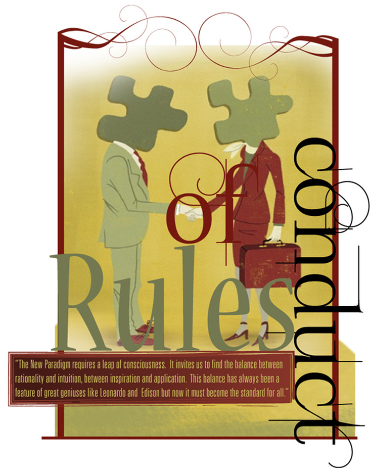
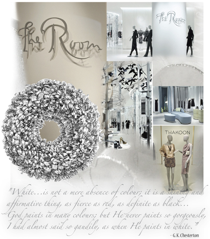
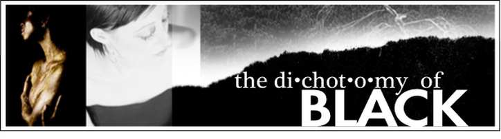
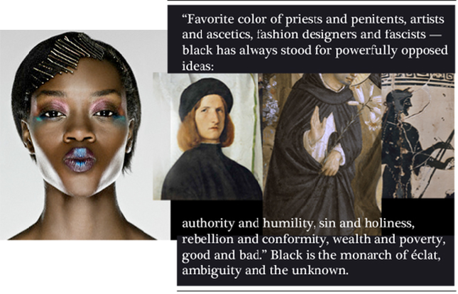
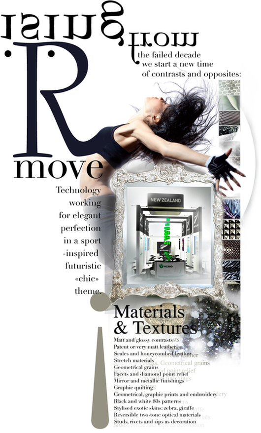 Rising from the remnants of the last decade that failed us in so many fronts, we start a new time line in which materials and textures will play with contrasts and opposites: black and white, natural and artificial, new and tainted, "dense and compact or seemingly dematerialised, changing, often playing with light". It is a time of paramount change driven by our emotion and performance to move and remake our moral ethics. It is a time of individual freedom and optimism along side with poetic global harmony. It is a time of New Urbanity, New Luxury, New Romanticism, New Exoticism. A demand for simplicity and striking, futuristic yet authentic. safe values with daring audacity, technical chic and alternative energies will be the dictum of our times. A need for personal expression, will bounce off restraints and radiate optimism. These two opposing currents will guide our tastes and desires, leading to a fresh burst of creativity, innovation and non-conformism. Technology will usher in elegant perfection in a sport-inspired futuristic «chic» theme. The two opposites black and white is the emotion leading to clarity and performance. Going back to the basics of black and the eternity of white with subtle light-and-shade effects, sometimes unexpected but always sharply contrasted will be the embracing co-ordinates of this time. Articles you might like
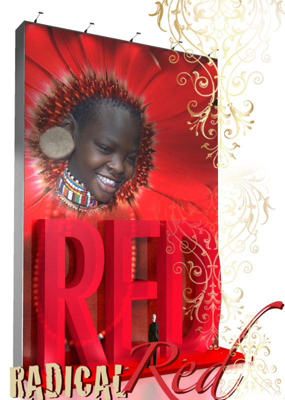
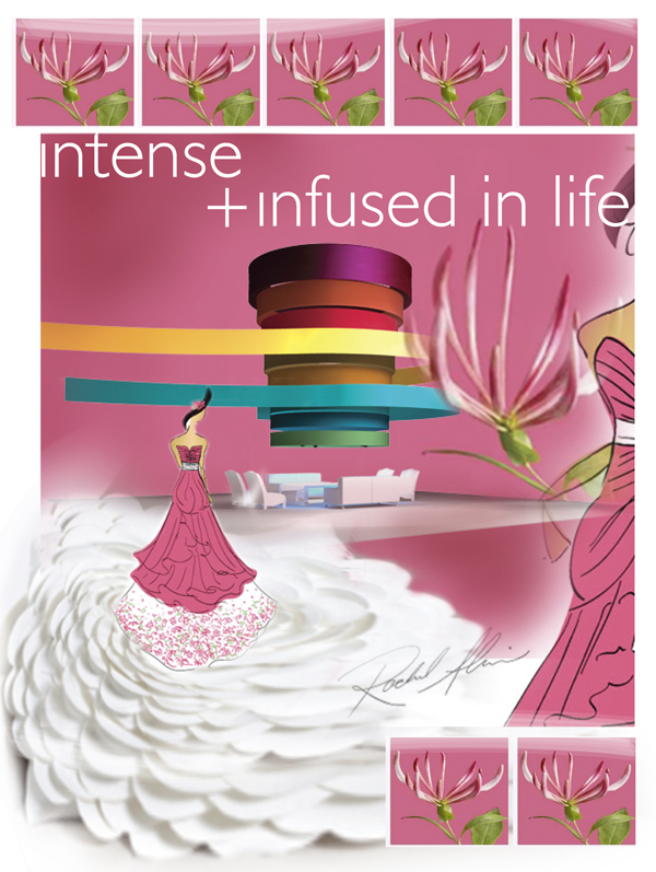 2011 promises to be radiant and floral. The world-renowned authority on color, Pantone Color Inc. states that 2011 will be honeysuckle hued. The color is from the magenta family, a violet pink of childish inventivenss. However, Pantone confirms: "A dynamic reddish pink, Honeysuckle is encouraging and uplifting. It elevates our psyche beyond escape, instilling the confidence, courage and spirit to meet the exhaustive challenges that have become part of everyday life." The company claims that while 2010 was all about Pantone 15-5519 turquoise and feelings of escape, 2011's honeysuckle tone will encourage us "to face everyday troubles with verve and vigor". It predicts we will see honeysuckle (Pantone 18-2120) in everything from women's clothes, cosmetics and accessories, to men's ties and shirts. The color will also flow to pillows, appliances and tabletop accessories and trendy trade show design booths. "In times of stress, we need something to lift our spirits. Honeysuckle is a captivating, stimulating, color that gets the adrenaline going, perfect to ward off the blues," said Leatrice Eiseman, executive director of the Pantone Color Institute. This trend in stimulating colors has taken off from the rich, intense and cultural colors that we see the market place oversaturated with. While brighter colors have lifted our spirit during the onset of tough economic times, they have an overt optimism that seems to be put of step with our everyday reality. Just as looking deep within us gives us the resolve to be determined, looking to colors that emerged as part of unique cultural heritage connects us to the strength of our ancient ancestors while blurring the boundaries between past and present. Today's attention getting hues coming on strong are tomato red, berry bright magenta, deep apricot, exotic coral and peacock blue.... Source: Sensational Color Articles you might like
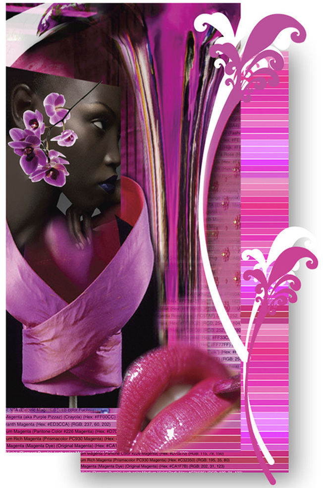 Magenta doesnot exist in a single wavelength of white light spectrum. The magic lies in our brain. Magenta is the result of the magic that the brain performs when it constructs a color to bridge the gap between red and violet, because such a colour does not exist in the light spectrum. Unlike all the other spectrum colors, Magenta is the only color that has no wavelength attributed to it. This means that perception of color does not have a one to one correlation with the “third dmensional” world that we live in… Color happens in the brain and is experienced in the mind. Sir Isaac Newton first noticed magenta to be an extra-spectral color when he was playing with prisms. When he superimposed the red end of the spectrum on to the violet end, he saw magenta. Magenta is nonconformist. Magenta is intelligent and innovative, often manifesting as inventors of bizarre or controversial objects. Their imagination has no limits. It is the color of the free spirit. It is agile and assertive. It is imaginative and productive. It is bright, determined and dances to it's own tune. Use magenta to energize your brand. Use it for its vigor and verve. Magenta is the color of change and transformation. It releases old and outdated patterns to inspire growth and development. Be bold with magenta on product launches. Instill the assertiveness of magenta in your product design. Play with magenta at corporate events and trade show pavilions. Magenta is a confluence of opposition. As a strong and inspiring color magenta can appear outrageous and shocking on one hand or innovative and imaginative on the other. Use it to be inspired or manipurate it for creating shock and awe! Articles you might like
|
Archives
September 2020
Categories
All
Don’t bend; don’t water it down; don’t try to make it logical; don’t edit your own soul according to the fashion. Rather, follow your most intense obsessions mercilessly. Franz Kafka |

 RSS Feed